The graphical representation of the time series is known as:
historigram
Understanding Time Series Representation
A time series is a sequence of data points measured at successive points in time or over successive time intervals. Examples include daily stock prices, yearly rainfall data, or hourly temperature readings. Analyzing time series data often involves looking at how the data changes over time, identifying trends, seasonality, and other patterns.
Graphical Representation of Time Series
To visualize the patterns and trends in a time series, we typically plot the data points on a graph. In this graph, time is usually plotted on the horizontal axis (the x-axis), and the values of the variable being measured are plotted on the vertical axis (the y-axis).
The specific term used for the graphical representation of a time series is a historigram.
A historigram is essentially a line graph where time is the independent variable (x-axis) and the time series data is the dependent variable (y-axis). The data points are plotted and usually connected by lines to show the progression over time.
Analyzing the Options
Let's look at why the other options are not the specific term for a time series graph:
- histogram: A histogram is used to represent the frequency distribution of a continuous variable. It uses bars to show how many data points fall into different ranges or bins. It does not specifically represent data over time.
- ogive: An ogive (also known as a cumulative frequency polygon) represents the cumulative frequency distribution. It shows the total number or proportion of observations that fall below a certain value. Like a histogram, it is not specifically for time series data plotted against time.
- straight line: A straight line is a specific type of graph, but it's not the general term for any graphical representation of a time series. A time series might show a straight line trend, but the graph itself is a historigram.
- historigram: As discussed, this is the specific term used for the graphical representation of a time series, plotting data values against time.
Therefore, the graphical representation of the time series is known as a historigram.
Revision Table: Data Representation Graphs
| Graph Type | What it Represents | Axis Description (Typical) |
|---|---|---|
| Histogram | Frequency distribution of a continuous variable | X-axis: Bins/Intervals of the variable Y-axis: Frequency |
| Ogive | Cumulative frequency distribution | X-axis: Upper limits of intervals Y-axis: Cumulative Frequency |
| Historigram (Time Series Graph) | Data values over time | X-axis: Time Y-axis: Data Value |
Additional Information on Time Series Plotting
Plotting a time series is often the first step in its analysis. A clear historigram can reveal:
- Trend: Is the data generally increasing, decreasing, or staying constant over the long term?
- Seasonality: Are there regular, repeating patterns within a fixed period (e.g., daily, weekly, monthly, yearly)?
- Cycles: Are there longer-term patterns that are not necessarily fixed in period?
- Irregularity (Noise): Are there random fluctuations in the data?
- Outliers: Are there unusual data points that deviate significantly from the pattern?
Understanding these components helps in choosing appropriate forecasting models or identifying causes for variations in the data over time.
Similar Questions
Following histogram shows certain frequency distribution against class intervals.
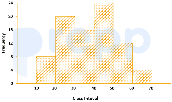
The approximated mean of this distribution is:
The annual vehicles production (in lacs) in india is given in the pie chart.
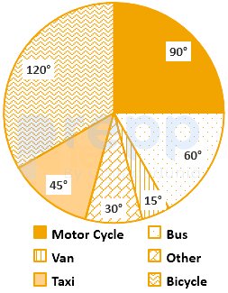
If the annual production of motor cycle is 1.80 lacs, the annual production of Bicycle is
For determination of mode and median graphically, one considers:
The curve obtained by joining the points, whose x-coordinates are the upper limits of the class interval and y-coordinates are corresponding cumulative frequencies is called:
The variation among the observations of each specific class is known as:
For making frequency distribution, the number of classes used depends upon:
When the collected data is grouped with reference to time, we have
Mutual and unique variances among multiple factors can be embodied in a diagram that comprises overlapping circles. The diagram is known as:
Which of the following is a method of collection of primary data?
The grouped data for the observation are
Class: 1-3 3-5 5-7 Frequency: 2 1 2 The population skewness
Important Questions from Classification of Data
The class marks in a frequency table are given to be 5, 10, 15, 20, 25, 30, 35, 40, 45, 50. The class limits of the first five classes are
In a test in Mathematics, 20% of the students obtained “first class”. If the data are represented by a Pie-Chart, what is the central angle corresponding to “first class”?
The following table gives the monthly expenditure of two families:
Expenditure (in Rs.)
Items
Family A
Family B
Food
3,500
2,700
Clothing
500
800
Rent
1,500
1,000
Education
2,000
1,800
Miscellaneous
2,500
1,800
In constructing a pie diagram to the above data, the radii of the circles are to be chosen by which one of the following ratios?
In an examination, 40% of candidates got second class. When the data are represented by a pie chart, what is the angle corresponding to second class?
Following histogram shows certain frequency distribution against class intervals.
The approximated mean of this distribution is: