Mutual and unique variances among multiple factors can be embodied in a diagram that comprises overlapping circles. The diagram is known as:
ballantine diagram
Understanding Diagrams for Mutual and Unique Variances Among Factors
The question asks about a specific type of diagram that uses overlapping circles to show how the variance (the spread or variation) of multiple factors is shared among them (mutual variance) or is specific to each factor (unique variance). Let's break down the concept and the diagram mentioned.
What is Mutual and Unique Variance?
When you study multiple factors or variables, some of their variation might be related. For example, studying factors like 'study time', 'sleep hours', and 'exam score'. The variation in 'study time' and 'sleep hours' might both contribute to the variation in 'exam score', and maybe 'study time' and 'sleep hours' themselves have some shared variation (e.g., people who study more might sleep less). This shared variation is called mutual variance. Any variation in 'study time' that isn't related to 'sleep hours' or 'exam score' is its unique variance.
Identifying the Diagram with Overlapping Circles
The description specifically mentions a diagram comprising overlapping circles that embodies mutual and unique variances among multiple factors. This visual representation is a key characteristic of a particular type of diagram used to show how variance is partitioned or shared.
Let's look at the options provided:
- Ballantine diagram
- Homogeneity diagram
- Path diagram
- 3-way scatterplot
Based on the description of using overlapping circles to represent shared and unique variance, the diagram that fits this description is the Ballantine diagram. This diagram is essentially a generalization of a Venn diagram to more than three variables, specifically used in statistical contexts (like factor analysis or regression) to illustrate the proportion of variance accounted for by different variables or factors and their overlaps.
In a Ballantine diagram:
- Each circle represents a factor or variable.
- The area of overlap between circles represents the mutual variance shared between those factors.
- The non-overlapping part of each circle represents the unique variance specific to that factor.
Why Other Options Are Not Correct
- Homogeneity diagram: This term is not standardly used to describe a diagram representing variance overlap. Homogeneity generally refers to data coming from the same distribution or group.
- Path diagram: Path diagrams are used in structural equation modeling (SEM) to show hypothesized direct and indirect effects among variables using arrows. While they relate to variance and covariance, they don't use overlapping circles to visualize variance decomposition in the way described.
- 3-way scatterplot: A scatterplot shows points representing data for typically two variables (or three in a 3D scatterplot). It visualizes the relationship or correlation between variables but does not use overlapping circles to depict mutual and unique variance components.
Therefore, the diagram described, using overlapping circles to embody mutual and unique variances among multiple factors, is the Ballantine diagram.
Revision Table: Comparing Diagram Types
| Diagram Type | Primary Use | Visual Representation | Represents Variance Overlap? |
|---|---|---|---|
| Ballantine Diagram | Illustrating mutual & unique variance among multiple factors | Overlapping circles | Yes |
| Venn Diagram (General) | Showing relationships between sets | Overlapping circles | Can be adapted to show variance overlap, but Ballantine is specific statistical context |
| Path Diagram | Showing relationships/effects among variables in SEM | Nodes and arrows | No (visualizes paths, not variance overlap directly with circles) |
| Scatterplot | Visualizing relationship between variables | Points on a graph | No (shows data points, not variance components with circles) |
Additional Information on Variance Partitioning
Understanding how variance is partitioned into mutual and unique components is crucial in multivariate statistics, especially in techniques like factor analysis, principal component analysis, and multiple regression. These methods aim to understand how different variables contribute to explaining the total variation in a dataset or a dependent variable.
While simple Venn diagrams are often used for 2 or 3 sets, extending the clear visual representation of all possible overlaps to more than 3 sets/factors becomes topologically complex. The Ballantine diagram specifically adapts the overlapping circle concept for representing statistical variance components in higher dimensions, although creating accurate area representations for many factors can still be challenging.
The concept of unique variance is sometimes also referred to as specific variance plus error variance, representing the part of a variable's variance that is not explained by the common factors it shares variance with.
Similar Questions
Following histogram shows certain frequency distribution against class intervals.
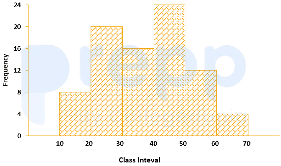
The approximated mean of this distribution is:
The annual vehicles production (in lacs) in india is given in the pie chart.
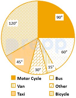
If the annual production of motor cycle is 1.80 lacs, the annual production of Bicycle is
For determination of mode and median graphically, one considers:
The curve obtained by joining the points, whose x-coordinates are the upper limits of the class interval and y-coordinates are corresponding cumulative frequencies is called:
Which statement of the following is incorrect?
The variation among the observations of each specific class is known as:
For making frequency distribution, the number of classes used depends upon:
When the collected data is grouped with reference to time, we have
The graphical representation of the time series is known as:
Which of the following is a method of collection of primary data?
Important Questions from Classification of Data
The class marks in a frequency table are given to be 5, 10, 15, 20, 25, 30, 35, 40, 45, 50. The class limits of the first five classes are
In a test in Mathematics, 20% of the students obtained “first class”. If the data are represented by a Pie-Chart, what is the central angle corresponding to “first class”?
The following table gives the monthly expenditure of two families:
Expenditure (in Rs.)
Items
Family A
Family B
Food
3,500
2,700
Clothing
500
800
Rent
1,500
1,000
Education
2,000
1,800
Miscellaneous
2,500
1,800
In constructing a pie diagram to the above data, the radii of the circles are to be chosen by which one of the following ratios?
In an examination, 40% of candidates got second class. When the data are represented by a pie chart, what is the angle corresponding to second class?
Following histogram shows certain frequency distribution against class intervals.
The approximated mean of this distribution is: