
The class marks in a frequency table are given to be 5, 10, 15, 20, 25, 30, 35, 40, 45, 50. The class limits of the first five classes are
2.5-7.5, 7.5-12.5, 12.5-17.5, 17.5-22.5, 22.5-27.5
Understanding Class Marks and Class Limits in Frequency Tables
In a frequency table, data is grouped into classes or class intervals. Each class has a lower limit and an upper limit. The class mark is the midpoint of a class interval and is calculated as the average of the lower and upper limits of that class.
We are given a series of class marks: 5, 10, 15, 20, 25, 30, 35, 40, 45, 50. We need to find the class limits for the first five classes.
Calculating Class Width
When class marks are given consecutively for class intervals of uniform width, the class width is the difference between any two consecutive class marks.
Let's calculate the difference between the first two class marks: Class width = 10 - 5 = 5.
We can verify this with other consecutive class marks: 15 - 10 = 5 20 - 15 = 5 ...and so on. So, the uniform class width is 5.
Relating Class Mark and Class Limits
For any class interval with lower limit \(L\) and upper limit \(U\), the class mark \(M\) and class width \(w\) are related by the following formulas:
- Class Mark (\(M\)) = \(\frac{L + U}{2}\)
- Class Width (\(w\)) = \(U - L\)
From these, we can derive formulas to find the lower and upper limits if we know the class mark and class width:
- Lower Limit (\(L\)) = \(M - \frac{w}{2}\)
- Upper Limit (\(U\)) = \(M + \frac{w}{2}\)
Finding the Class Limits for the First Five Classes
We have the class width \(w = 5\). Now we will use the derived formulas to find the class limits for the first five class marks (5, 10, 15, 20, 25).
Class 1: Class Mark = 5
- Lower Limit (\(L_1\)) = \(5 - \frac{5}{2} = 5 - 2.5 = 2.5\)
- Upper Limit (\(U_1\)) = \(5 + \frac{5}{2} = 5 + 2.5 = 7.5\)
The first class interval is 2.5 - 7.5.
Class 2: Class Mark = 10
- Lower Limit (\(L_2\)) = \(10 - \frac{5}{2} = 10 - 2.5 = 7.5\)
- Upper Limit (\(U_2\)) = \(10 + \frac{5}{2} = 10 + 2.5 = 12.5\)
The second class interval is 7.5 - 12.5.
Class 3: Class Mark = 15
- Lower Limit (\(L_3\)) = \(15 - \frac{5}{2} = 15 - 2.5 = 12.5\)
- Upper Limit (\(U_3\)) = \(15 + \frac{5}{2} = 15 + 2.5 = 17.5\)
The third class interval is 12.5 - 17.5.
Class 4: Class Mark = 20
- Lower Limit (\(L_4\)) = \(20 - \frac{5}{2} = 20 - 2.5 = 17.5\)
- Upper Limit (\(U_4\)) = \(20 + \frac{5}{2} = 20 + 2.5 = 22.5\)
The fourth class interval is 17.5 - 22.5.
Class 5: Class Mark = 25
- Lower Limit (\(L_5\)) = \(25 - \frac{5}{2} = 25 - 2.5 = 22.5\)
- Upper Limit (\(U_5\)) = \(25 + \frac{5}{2} = 25 + 2.5 = 27.5\)
The fifth class interval is 22.5 - 27.5.
Summary of First Five Class Limits
The class limits for the first five classes are:
- 2.5 - 7.5
- 7.5 - 12.5
- 12.5 - 17.5
- 17.5 - 22.5
- 22.5 - 27.5
Comparison with Options
Let's compare our calculated class limits with the given options:
| Calculated Limits | Option 1 | Option 2 | Option 3 | Option 4 |
|---|---|---|---|---|
| 2.5 - 7.5 | 3 - 7 | 2.5 - 7.5 | 1.5 - 8.5 | 2 - 8 |
| 7.5 - 12.5 | 7 - 13 | 7.5 - 12.5 | 8.5 - 11.5 | 8 - 12 |
| 12.5 - 17.5 | 13 - 17 | 12.5 - 17.5 | 11.5 - 18.5 | 12 - 18 |
| 17.5 - 22.5 | 17 - 23 | 17.5 - 22.5 | 18.5 - 21.5 | 18 - 22 |
| 22.5 - 27.5 | 23 - 27 | 22.5 - 27.5 | 21.5 - 28.5 | 22 - 28 |
The calculated class limits match the intervals provided in Option 2.
Revision Table: Key Concepts in Frequency Distribution
| Concept | Definition | How to Calculate (if applicable) |
|---|---|---|
| Frequency Distribution | A table that shows the frequency of occurrence of data values in different classes. | Organize data into classes and count occurrences. |
| Class Interval | A range of values within which the data is grouped. Represented as Lower Limit - Upper Limit. | Decided based on range of data and number of classes. |
| Lower Class Limit | The smallest value that can be included in a class interval. | \(L = M - w/2\) |
| Upper Class Limit | The largest value that can be included in a class interval. | \(U = M + w/2\) |
| Class Mark (Midpoint) | The middle value of a class interval. | \(M = (L + U)/2\) |
| Class Width (Size) | The difference between the upper and lower class limits (for exclusive classes) or the difference between two consecutive lower limits (or upper limits). | \(w = U - L\) or Difference between consecutive class marks. |
| Frequency | The number of data values that fall within a specific class interval. | Count of observations in the class. |
Additional Information: Types of Class Intervals
Class intervals can be represented in different ways, affecting how limits and boundaries are defined:
- Exclusive Method: The upper limit of one class is the lower limit of the next class. The upper limit is generally not included in the class. For example, 10-20, 20-30. A value of 20 would fall in the 20-30 class, not 10-20. This is common for continuous data. The class limits calculated in this problem (2.5-7.5, etc.) follow this pattern if interpreted strictly, where 7.5 is the upper limit of the first class and the lower limit of the second, etc.
- Inclusive Method: Both the lower and upper limits are included in the class. The upper limit of one class is not the lower limit of the next class; there is a gap between them. For example, 10-19, 20-29. This is common for discrete data. To get continuous boundaries for calculations (like finding median, quartiles), class boundaries are calculated. Class Boundary = Lower Limit - 0.5 (or half the gap) and Upper Limit + 0.5 (or half the gap). In our problem, the calculated limits 2.5-7.5 etc. are effectively class boundaries used with the exclusive method, which makes sense as consecutive class marks imply continuous data or continuous representation.
Understanding the difference between class limits and class boundaries is crucial, especially when dealing with grouped data for calculating measures like the mean, median, and mode. In the exclusive method, class limits often serve as class boundaries.
Similar Questions
In a test in Mathematics, 20% of the students obtained “first class”. If the data are represented by a Pie-Chart, what is the central angle corresponding to “first class”?
The following table gives the monthly expenditure of two families:
Expenditure (in Rs.)
Items
Family A
Family B
Food
3,500
2,700
Clothing
500
800
Rent
1,500
1,000
Education
2,000
1,800
Miscellaneous
2,500
1,800
In constructing a pie diagram to the above data, the radii of the circles are to be chosen by which one of the following ratios?
In an examination, 40% of candidates got second class. When the data are represented by a pie chart, what is the angle corresponding to second class?
For a histogram based on a frequency distribution with unequal class intervals, the frequency of a class should be proportional to:
The numbers of Science, Arts and Commerce graduates working in a company are 30, 70 and 50 respectively. If these figures are represented by a pie chart, then what is the angle corresponding to Science graduates?
Consider the following statements:
Statement 1: Range is not a good measure of dispersion.
Statement 2: Range is highly affected by the existence of extreme values.
Which one of the following is correct in respect of the above statements?
Data can be represented in which of the following forms?
1. Textual form
2. Tabula form
3. Graphical form
Select the correct answer using the code given below.Consider the following statements in respect of a histogram:
1. The total area of the rectangles in a histogram is equal to the total area bounded by the corresponding frequency polygon and the x-axis.
2. When class intervals are unequal in a frequency distribution, the area of the rectangle is proportional to the frequency.
Which of the above statements is/are correct?A set of annual numerical data, comparable over the years, is given for the last 12 years.
Consider the following statements:
1. The data is best represented by a broken line graph, each corner (turning point) representing the data of one year.
2. Such a graph depicts the chronological change and also enables one to make a short-term forecast.
Which of the above statements is/are correct?
Important Questions from Classification of Data
In a test in Mathematics, 20% of the students obtained “first class”. If the data are represented by a Pie-Chart, what is the central angle corresponding to “first class”?
The following table gives the monthly expenditure of two families:
Expenditure (in Rs.)
Items
Family A
Family B
Food
3,500
2,700
Clothing
500
800
Rent
1,500
1,000
Education
2,000
1,800
Miscellaneous
2,500
1,800
In constructing a pie diagram to the above data, the radii of the circles are to be chosen by which one of the following ratios?
In an examination, 40% of candidates got second class. When the data are represented by a pie chart, what is the angle corresponding to second class?
Following histogram shows certain frequency distribution against class intervals.
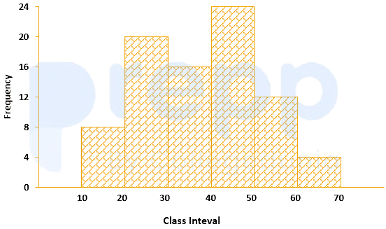
The approximated mean of this distribution is:
The annual vehicles production (in lacs) in india is given in the pie chart.
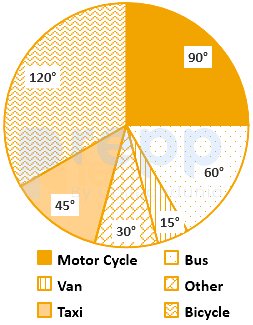
If the annual production of motor cycle is 1.80 lacs, the annual production of Bicycle is



