
A set of annual numerical data, comparable over the years, is given for the last 12 years. Consider the following statements: 1. The data is best represented by a broken line graph, each corner (turning point) representing the data of one year. 2. Such a graph depicts the chronological change and also enables one to make a short-term forecast.
Both 1 and 2
Representing Annual Numerical Data with Graphs
When dealing with numerical data collected over a period, like annual data spanning 12 years, it is important to choose the right graphical representation to visualize trends and patterns effectively. The question asks about using a broken line graph for this type of data and its properties.
Analysis of Statement 1: Broken Line Graph Representation
Statement 1 suggests that a broken line graph best represents annual numerical data over the years, with each corner (turning point) representing the data for one year.
- Annual data is a type of time series data, where observations are recorded at regular intervals (in this case, yearly).
- Line graphs, specifically broken line graphs, are commonly used to display time series data.
- In a line graph, the x-axis typically represents time (years in this case), and the y-axis represents the numerical value of the data.
- Points are plotted for each year's data, and these points are connected by lines. Each point plotted on the graph corresponds to the data for a specific year.
- The points where the line changes direction are the 'corners' or turning points, and they indeed represent the data value for that particular year on the x-axis.
Therefore, representing annual numerical data comparable over the years with a broken line graph where corners represent yearly data is a standard and appropriate method.
Analysis of Statement 2: Depicting Chronological Change and Forecasting
Statement 2 claims that such a graph depicts chronological change and enables short-term forecasting.
- Chronological Change: A line graph inherently shows how the data changes over time. By connecting the points chronologically (year after year), the graph visually represents the trend, fluctuations, increases, or decreases in the data values over the 12-year period. This is precisely depicting chronological change.
- Short-term Forecasting: Observing the trend shown by the line graph over the past 12 years can help in making educated guesses or predictions about future values for the immediate next period (short-term). For instance, if the graph shows a steady upward trend, one might forecast a further increase in the near future. While graphical forecasting is basic and subject to error, a line graph certainly enables one to visually assess trends and attempt short-term forecasts based on extrapolation or observed patterns.
Thus, a line graph is useful for understanding past changes over time and can be used as a tool for simple short-term forecasting.
Conclusion on Statements
Based on the analysis:
- Statement 1 accurately describes the appropriate graphical representation (broken line graph) for annual numerical data over time, correctly identifying that each plotted point (corner) corresponds to a year's data.
- Statement 2 correctly identifies two key benefits of using a line graph for time series data: showing changes over time (chronological change) and facilitating short-term forecasting based on observed trends.
Both statements are correct descriptions related to using broken line graphs for analyzing annual numerical data.
| Statement | Analysis | Correctness |
|---|---|---|
| 1. Data best represented by a broken line graph, each corner representing a year's data. | Line graphs are standard for time series data; points/corners represent values at specific times (years). | Correct |
| 2. Graph depicts chronological change and enables short-term forecast. | Line graphs show trends over time (chronological change); trends can be used for simple short-term forecasting. | Correct |
Revision Table: Data Representation and Forecasting
| Concept | Description | Relevance to Question |
|---|---|---|
| Broken Line Graph | A graph displaying data points connected by line segments, typically used for time series data to show trends over time. | Primary type of graph discussed for annual data. |
| Annual Data | Numerical data collected or recorded on a yearly basis. | The type of data being analyzed. |
| Chronological Change | How data values vary or evolve in order of time. | A key feature depicted by a line graph. |
| Short-term Forecast | Predicting future data values for the immediate upcoming period based on past patterns and trends. | A capability enabled by observing line graph trends. |
Additional Information: Types of Graphs for Data Analysis
While a broken line graph is excellent for time series data like annual figures, other graph types serve different purposes:
- Bar Graphs: Useful for comparing discrete categories or showing changes over time, but lines explicitly connect points to show trends, which is better for continuous time series.
- Histograms: Represent the distribution of numerical data by dividing it into bins and showing the frequency of data points in each bin. Not suitable for tracking specific values over time.
- Scatter Plots: Show the relationship between two numerical variables. Can be used for time series if time is one variable, but lines connect points to emphasize sequence and trend over time, making it a line graph.
- Pie Charts: Show proportions of a whole. Not suitable for tracking data changes over time.
Understanding the nature of the data and the insights needed helps in choosing the most appropriate graph type for data analysis and visualization.
Similar Questions
The class marks in a frequency table are given to be 5, 10, 15, 20, 25, 30, 35, 40, 45, 50. The class limits of the first five classes are
In a test in Mathematics, 20% of the students obtained “first class”. If the data are represented by a Pie-Chart, what is the central angle corresponding to “first class”?
The following table gives the monthly expenditure of two families:
Expenditure (in Rs.)
Items
Family A
Family B
Food
3,500
2,700
Clothing
500
800
Rent
1,500
1,000
Education
2,000
1,800
Miscellaneous
2,500
1,800
In constructing a pie diagram to the above data, the radii of the circles are to be chosen by which one of the following ratios?
In an examination, 40% of candidates got second class. When the data are represented by a pie chart, what is the angle corresponding to second class?
For a histogram based on a frequency distribution with unequal class intervals, the frequency of a class should be proportional to:
The numbers of Science, Arts and Commerce graduates working in a company are 30, 70 and 50 respectively. If these figures are represented by a pie chart, then what is the angle corresponding to Science graduates?
Consider the following statements:
Statement 1: Range is not a good measure of dispersion.
Statement 2: Range is highly affected by the existence of extreme values.
Which one of the following is correct in respect of the above statements?
Data can be represented in which of the following forms?
1. Textual form
2. Tabula form
3. Graphical form
Select the correct answer using the code given below.Consider the following statements in respect of a histogram:
1. The total area of the rectangles in a histogram is equal to the total area bounded by the corresponding frequency polygon and the x-axis.
2. When class intervals are unequal in a frequency distribution, the area of the rectangle is proportional to the frequency.
Which of the above statements is/are correct?
Important Questions from Classification of Data
The class marks in a frequency table are given to be 5, 10, 15, 20, 25, 30, 35, 40, 45, 50. The class limits of the first five classes are
In a test in Mathematics, 20% of the students obtained “first class”. If the data are represented by a Pie-Chart, what is the central angle corresponding to “first class”?
The following table gives the monthly expenditure of two families:
Expenditure (in Rs.)
Items
Family A
Family B
Food
3,500
2,700
Clothing
500
800
Rent
1,500
1,000
Education
2,000
1,800
Miscellaneous
2,500
1,800
In constructing a pie diagram to the above data, the radii of the circles are to be chosen by which one of the following ratios?
In an examination, 40% of candidates got second class. When the data are represented by a pie chart, what is the angle corresponding to second class?
Following histogram shows certain frequency distribution against class intervals.
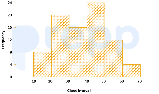
The approximated mean of this distribution is:



