
Data can be represented in which of the following forms? 1. Textual form 2. Tabula form 3. Graphical form
1, 2 and 3
Understanding Data Representation Forms
Data is a collection of facts, figures, objects, symbols, and events gathered from different sources. To make sense of data and use it effectively, it needs to be organized and presented in various forms. Let's explore the common ways data can be represented as mentioned in the options.
Forms of Data Representation
Data can be represented in multiple forms, depending on its nature, purpose, and the target audience. The question lists three specific forms:
1. Textual Form of Data
This is one of the most basic forms of data representation. In the textual form, data is presented using words, sentences, paragraphs, and sometimes numbers embedded within text. Think of a written report, a description of an event, or an article.
- Examples: A news report, a story, notes taken during a meeting, a simple list of items written down.
- Characteristics: Primarily uses human language, often unstructured or semi-structured.
2. Tabular Form of Data
In the tabular form, data is organized into rows and columns, similar to a table or a spreadsheet. Each column represents a specific attribute or category, and each row represents a record or an instance of the data.
- Examples: A spreadsheet listing student names, ages, and grades; a database table with customer information; a timetable.
- Characteristics: Highly structured, organized into distinct fields (columns) and records (rows), easy to sort and filter.
| Student Name | Age | Grade |
|---|---|---|
| Alice | 16 | A |
| Bob | 17 | B |
| Charlie | 16 | A |
3. Graphical Form of Data
The graphical form represents data using visual elements such as charts, graphs, diagrams, images, and maps. This form is particularly useful for identifying patterns, trends, and relationships in data, making complex information easier to understand quickly.
- Examples: Bar charts showing sales figures over months, line graphs depicting temperature changes over time, pie charts illustrating market share, scatter plots showing correlation between two variables, an image representing data points.
- Characteristics: Visual, often used for data visualization, effective for summarizing large datasets and showing relationships.
Analysis of the Options
The question asks in which forms data can be represented, offering textual, tabular, and graphical as possibilities. As we have discussed, data can indeed be represented in all three of these forms:
- Data can be written out in plain textual form.
- Data can be structured in rows and columns in a tabular form.
- Data can be visually displayed using charts and graphs in a graphical form.
Therefore, all three listed forms are valid ways to represent data.
Based on this analysis:
- Option 1 (1 and 2 only) is incomplete as it excludes graphical form.
- Option 2 (2 and 3 only) is incomplete as it excludes textual form.
- Option 3 (1 and 3 only) is incomplete as it excludes tabular form.
- Option 4 (1, 2 and 3) includes all three forms, which are valid methods of data representation.
Thus, data can be represented in textual, tabular, and graphical forms.
Revision Table: Data Representation Forms
| Form | Description | Typical Use Cases |
|---|---|---|
| Textual | Data presented as plain text, words, and numbers within sentences or paragraphs. | Reports, articles, descriptions, notes. |
| Tabular | Data organized in rows and columns (tables). | Spreadsheets, databases, structured lists. |
| Graphical | Data represented using visual elements like charts, graphs, images. | Data visualization, showing trends, comparisons, distributions. |
Additional Information on Data Forms and Representation
Understanding the different forms of data representation is crucial in fields like data analysis, computer science, and statistics. The choice of representation depends on various factors:
- Type of Data: Is it numerical, categorical, text, or something else?
- Purpose: Is it for storage, analysis, presentation, or communication?
- Audience: Who needs to understand the data? (e.g., a detailed table for analysts vs. a simple graph for the general public).
- Tools Available: What software or methods are being used?
While textual, tabular, and graphical are common forms, data can also exist in other formats, such as audio, video, or binary forms, especially in digital systems. However, for standard presentation and analysis purposes, the three forms mentioned in the question are fundamental.
Similar Questions
The class marks in a frequency table are given to be 5, 10, 15, 20, 25, 30, 35, 40, 45, 50. The class limits of the first five classes are
In a test in Mathematics, 20% of the students obtained “first class”. If the data are represented by a Pie-Chart, what is the central angle corresponding to “first class”?
The following table gives the monthly expenditure of two families:
Expenditure (in Rs.)
Items
Family A
Family B
Food
3,500
2,700
Clothing
500
800
Rent
1,500
1,000
Education
2,000
1,800
Miscellaneous
2,500
1,800
In constructing a pie diagram to the above data, the radii of the circles are to be chosen by which one of the following ratios?
In an examination, 40% of candidates got second class. When the data are represented by a pie chart, what is the angle corresponding to second class?
For a histogram based on a frequency distribution with unequal class intervals, the frequency of a class should be proportional to:
The numbers of Science, Arts and Commerce graduates working in a company are 30, 70 and 50 respectively. If these figures are represented by a pie chart, then what is the angle corresponding to Science graduates?
Consider the following statements:
Statement 1: Range is not a good measure of dispersion.
Statement 2: Range is highly affected by the existence of extreme values.
Which one of the following is correct in respect of the above statements?
Consider the following statements in respect of a histogram:
1. The total area of the rectangles in a histogram is equal to the total area bounded by the corresponding frequency polygon and the x-axis.
2. When class intervals are unequal in a frequency distribution, the area of the rectangle is proportional to the frequency.
Which of the above statements is/are correct?A set of annual numerical data, comparable over the years, is given for the last 12 years.
Consider the following statements:
1. The data is best represented by a broken line graph, each corner (turning point) representing the data of one year.
2. Such a graph depicts the chronological change and also enables one to make a short-term forecast.
Which of the above statements is/are correct?
Important Questions from Classification of Data
The class marks in a frequency table are given to be 5, 10, 15, 20, 25, 30, 35, 40, 45, 50. The class limits of the first five classes are
In a test in Mathematics, 20% of the students obtained “first class”. If the data are represented by a Pie-Chart, what is the central angle corresponding to “first class”?
The following table gives the monthly expenditure of two families:
Expenditure (in Rs.)
Items
Family A
Family B
Food
3,500
2,700
Clothing
500
800
Rent
1,500
1,000
Education
2,000
1,800
Miscellaneous
2,500
1,800
In constructing a pie diagram to the above data, the radii of the circles are to be chosen by which one of the following ratios?
In an examination, 40% of candidates got second class. When the data are represented by a pie chart, what is the angle corresponding to second class?
Following histogram shows certain frequency distribution against class intervals.
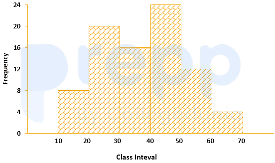
The approximated mean of this distribution is:



