
Consider the following statements in respect of a histogram: 1. The total area of the rectangles in a histogram is equal to the total area bounded by the corresponding frequency polygon and the x-axis. 2. When class intervals are unequal in a frequency distribution, the area of the rectangle is proportional to the frequency.
Both 1 and 2
Understanding Statements on Histograms
A histogram is a graphical representation of the distribution of numerical data. It is an estimate of the probability distribution of a continuous variable (quantitative variable). To construct a histogram, the first step is to "bin" the range of values—that is, divide the entire range of values into a series of intervals—and then count how many values fall into each interval.
Analyzing Statement 1: Area of Histogram vs. Frequency Polygon
Statement 1 says that the total area of the rectangles in a histogram is equal to the total area bounded by the corresponding frequency polygon and the x-axis.
A frequency polygon is constructed by joining the midpoints of the top edges of the adjacent rectangles of a histogram with straight lines. If we also join the midpoint of the top edge of the first rectangle to the midpoint of the class interval just before the first class (with zero frequency) on the x-axis, and similarly, the midpoint of the top edge of the last rectangle to the midpoint of the class interval just after the last class (with zero frequency) on the x-axis, we get a closed figure.
When comparing the area of the histogram and the frequency polygon constructed this way, it can be shown that the area added by the frequency polygon outside the histogram bars in some parts is equal to the area removed from inside the histogram bars in other parts. Therefore, the total area under the frequency polygon (bounded by the polygon and the x-axis) is indeed equal to the total area of the rectangles in the histogram.
So, Statement 1 is correct.
Analyzing Statement 2: Area Proportionality in Histograms with Unequal Class Intervals
Statement 2 says that when class intervals are unequal in a frequency distribution, the area of the rectangle is proportional to the frequency.
In a histogram, when the class intervals are of equal width, the height of each rectangle is made proportional to the frequency of the corresponding class. In this case, the area of the rectangle (width \(\times\) height) is also proportional to the frequency (since width is constant).
However, when the class intervals are of unequal width, simply making the height proportional to the frequency would make the areas of wider classes disproportionately large compared to their frequency. To ensure that the histogram accurately represents the distribution, it is the area of the rectangle that must be made proportional to the frequency. This means the height of the rectangle for a class with unequal width is calculated as:
\text{Height} = \frac{\text{Frequency}}{\text{Width of the class}} \times \text{Constant (often the minimum class width)}
This constant factor ensures that the area of the rectangle is proportional to the frequency. The quantity \(\frac{\text{Frequency}}{\text{Width of the class}}\) is called the frequency density.
Thus, when class intervals are unequal, the principle is that the area of the rectangle represents the frequency, meaning the area is proportional to the frequency.
So, Statement 2 is correct.
Conclusion
Based on the analysis of both statements:
- Statement 1 regarding the equality of areas between a histogram and its corresponding frequency polygon is correct.
- Statement 2 regarding the proportionality of area to frequency when class intervals are unequal is correct.
Therefore, both statements are correct.
Similar Questions
The class marks in a frequency table are given to be 5, 10, 15, 20, 25, 30, 35, 40, 45, 50. The class limits of the first five classes are
In a test in Mathematics, 20% of the students obtained “first class”. If the data are represented by a Pie-Chart, what is the central angle corresponding to “first class”?
The following table gives the monthly expenditure of two families:
Expenditure (in Rs.)
Items
Family A
Family B
Food
3,500
2,700
Clothing
500
800
Rent
1,500
1,000
Education
2,000
1,800
Miscellaneous
2,500
1,800
In constructing a pie diagram to the above data, the radii of the circles are to be chosen by which one of the following ratios?
In an examination, 40% of candidates got second class. When the data are represented by a pie chart, what is the angle corresponding to second class?
For a histogram based on a frequency distribution with unequal class intervals, the frequency of a class should be proportional to:
The numbers of Science, Arts and Commerce graduates working in a company are 30, 70 and 50 respectively. If these figures are represented by a pie chart, then what is the angle corresponding to Science graduates?
Consider the following statements:
Statement 1: Range is not a good measure of dispersion.
Statement 2: Range is highly affected by the existence of extreme values.
Which one of the following is correct in respect of the above statements?
Data can be represented in which of the following forms?
1. Textual form
2. Tabula form
3. Graphical form
Select the correct answer using the code given below.A set of annual numerical data, comparable over the years, is given for the last 12 years.
Consider the following statements:
1. The data is best represented by a broken line graph, each corner (turning point) representing the data of one year.
2. Such a graph depicts the chronological change and also enables one to make a short-term forecast.
Which of the above statements is/are correct?
Important Questions from Classification of Data
The class marks in a frequency table are given to be 5, 10, 15, 20, 25, 30, 35, 40, 45, 50. The class limits of the first five classes are
In a test in Mathematics, 20% of the students obtained “first class”. If the data are represented by a Pie-Chart, what is the central angle corresponding to “first class”?
The following table gives the monthly expenditure of two families:
Expenditure (in Rs.)
Items
Family A
Family B
Food
3,500
2,700
Clothing
500
800
Rent
1,500
1,000
Education
2,000
1,800
Miscellaneous
2,500
1,800
In constructing a pie diagram to the above data, the radii of the circles are to be chosen by which one of the following ratios?
In an examination, 40% of candidates got second class. When the data are represented by a pie chart, what is the angle corresponding to second class?
Following histogram shows certain frequency distribution against class intervals.
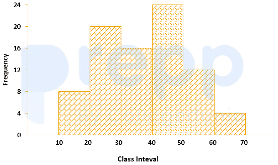
The approximated mean of this distribution is:



