
In an examination, 40% of candidates got second class. When the data are represented by a pie chart, what is the angle corresponding to second class?
144°
Understanding Pie Charts and Angles
A pie chart is a visual representation of data where the whole quantity is represented by a circle. The circle is divided into sectors, and the area of each sector is proportional to the percentage of the whole that it represents. A complete circle measures 360 degrees at the center.
In this question, we are given that 40% of candidates in an examination got second class. We need to find the angle corresponding to this 40% in a pie chart.
Calculating the Angle for a Percentage in a Pie Chart
The total percentage in any data set is 100%. In a pie chart, this 100% corresponds to the full angle of the circle, which is 360 degrees. To find the angle corresponding to a specific percentage, we can use the following relationship:
If 100% corresponds to 360°, then 1% corresponds to \(\frac{360}{100}\) degrees.
To find the angle for any given percentage, say P%, we can use the formula:
Angle for P% = \(\text{P%} \times \frac{360\degree}{100\%}\)
In this problem, the percentage is 40%. So, we need to calculate the angle for 40%.
Angle for 40% = \(40\% \times \frac{360\degree}{100\%}\)
Now let's perform the calculation:
Angle = \(\frac{40}{100} \times 360\degree\)
Angle = \(\frac{4}{10} \times 360\degree\)
Angle = \(4 \times \frac{360}{10}\degree\)
Angle = \(4 \times 36\degree\)
Angle = \(144\degree\)
So, the angle corresponding to 40% of candidates who got second class in the pie chart is 144 degrees.
Verification of Pie Chart Calculation
We can quickly verify this calculation. If 40% is 144°, then 10% should be \(\frac{144}{4} = 36\degree\). And 100% should be \(10 \times 36\degree = 360\degree\), which is correct for a full circle.
Revision Table: Pie Chart Angles
| Percentage of Data | Corresponding Angle in Pie Chart |
|---|---|
| 1% | \(\frac{360\degree}{100} = 3.6\degree\) |
| 10% | \(10 \times 3.6\degree = 36\degree\) |
| 25% | \(25 \times 3.6\degree = 90\degree\) (Right Angle) |
| 50% | \(50 \times 3.6\degree = 180\degree\) (Straight Angle) |
| 100% | \(100 \times 3.6\degree = 360\degree\) (Full Circle) |
| 40% | \(40 \times 3.6\degree = 144\degree\) |
Additional Information on Data Representation
Pie charts are commonly used to show the proportion of different categories within a whole. They are most effective when you have a small number of categories. Other methods of data representation include:
- Bar Graphs: Used to compare different categories or track changes over time. The height or length of bars represents the values.
- Histograms: Similar to bar graphs but used for continuous data grouped into ranges (bins). The bars touch each other.
- Line Graphs: Used to show trends over time. Points representing data values are connected by lines.
- Scatter Plots: Used to show the relationship between two numerical variables. Data points are plotted as dots on a graph.
Each type of chart or graph has its strengths and is suitable for representing different types of data and highlighting different aspects of the data. Understanding how to convert percentages to angles is fundamental when constructing or interpreting pie charts.
Similar Questions
The class marks in a frequency table are given to be 5, 10, 15, 20, 25, 30, 35, 40, 45, 50. The class limits of the first five classes are
In a test in Mathematics, 20% of the students obtained “first class”. If the data are represented by a Pie-Chart, what is the central angle corresponding to “first class”?
The following table gives the monthly expenditure of two families:
Expenditure (in Rs.)
Items
Family A
Family B
Food
3,500
2,700
Clothing
500
800
Rent
1,500
1,000
Education
2,000
1,800
Miscellaneous
2,500
1,800
In constructing a pie diagram to the above data, the radii of the circles are to be chosen by which one of the following ratios?
For a histogram based on a frequency distribution with unequal class intervals, the frequency of a class should be proportional to:
The numbers of Science, Arts and Commerce graduates working in a company are 30, 70 and 50 respectively. If these figures are represented by a pie chart, then what is the angle corresponding to Science graduates?
Consider the following statements:
Statement 1: Range is not a good measure of dispersion.
Statement 2: Range is highly affected by the existence of extreme values.
Which one of the following is correct in respect of the above statements?
Data can be represented in which of the following forms?
1. Textual form
2. Tabula form
3. Graphical form
Select the correct answer using the code given below.Consider the following statements in respect of a histogram:
1. The total area of the rectangles in a histogram is equal to the total area bounded by the corresponding frequency polygon and the x-axis.
2. When class intervals are unequal in a frequency distribution, the area of the rectangle is proportional to the frequency.
Which of the above statements is/are correct?A set of annual numerical data, comparable over the years, is given for the last 12 years.
Consider the following statements:
1. The data is best represented by a broken line graph, each corner (turning point) representing the data of one year.
2. Such a graph depicts the chronological change and also enables one to make a short-term forecast.
Which of the above statements is/are correct?
Important Questions from Classification of Data
The class marks in a frequency table are given to be 5, 10, 15, 20, 25, 30, 35, 40, 45, 50. The class limits of the first five classes are
In a test in Mathematics, 20% of the students obtained “first class”. If the data are represented by a Pie-Chart, what is the central angle corresponding to “first class”?
The following table gives the monthly expenditure of two families:
Expenditure (in Rs.)
Items
Family A
Family B
Food
3,500
2,700
Clothing
500
800
Rent
1,500
1,000
Education
2,000
1,800
Miscellaneous
2,500
1,800
In constructing a pie diagram to the above data, the radii of the circles are to be chosen by which one of the following ratios?
Following histogram shows certain frequency distribution against class intervals.
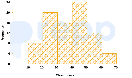
The approximated mean of this distribution is:
The annual vehicles production (in lacs) in india is given in the pie chart.
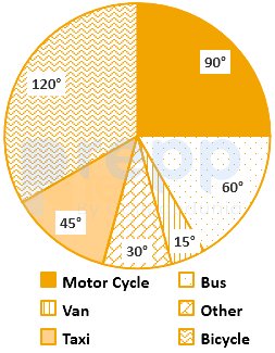
If the annual production of motor cycle is 1.80 lacs, the annual production of Bicycle is



