For determination of mode and median graphically, one considers:
Histogram and Ogive
Graphical Determination of Mode and Median
In statistics, graphical methods provide visual ways to understand and find measures of central tendency like mode and median. Different types of graphs are used for different purposes and different measures.
Graphical Determination of Mode using Histogram
The mode is the value that appears most frequently in a data set. For continuous data presented in frequency distributions, the mode can be graphically determined using a Histogram.
- First, construct the histogram for the given data. The highest rectangle in the histogram represents the modal class (the class interval with the highest frequency).
- To find the exact mode within this modal class, draw lines from the top corners of the modal rectangle to the opposite top corners of the adjacent rectangles (the rectangle preceding and succeeding the modal class).
- The point where these two lines intersect is located within the modal class rectangle.
- Draw a perpendicular line from this intersection point down to the x-axis.
- The value on the x-axis where this perpendicular line touches is the graphical mode.
This method is specifically used for finding the mode of a continuous frequency distribution.
Graphical Determination of Median using Ogive
The median is the middle value of a data set when it is arranged in order. For grouped data, the median can be graphically determined using an Ogive, which is a cumulative frequency curve.
- There are two types of Ogives: the 'less than' Ogive and the 'more than' Ogive.
- To find the median, you can use either one Ogive or both together.
- Using a single Ogive (e.g., 'less than' Ogive):
- Plot the cumulative frequencies against the upper limits of the class intervals. Connect the points with a smooth curve to get the 'less than' Ogive.
- Calculate the total frequency, \(N\). The median corresponds to the value at the \((N/2)\)-th position.
- Locate \(N/2\) on the cumulative frequency (y-axis).
- From this point on the y-axis, draw a horizontal line to intersect the Ogive curve.
- From the intersection point on the curve, draw a perpendicular line down to the x-axis.
- The value on the x-axis where this perpendicular line touches is the graphical median.
- Using both Ogives:
- Plot both the 'less than' and the 'more than' Ogives on the same graph.
- The point where the two Ogives intersect corresponds to the median.
- Draw a perpendicular line from this intersection point down to the x-axis.
- The value on the x-axis where this perpendicular line touches is the graphical median.
Ogive is the standard graphical tool for finding the median of a frequency distribution because it shows cumulative values, which are necessary to locate the middle value.
Conclusion
Based on these graphical methods:
- The mode of a continuous frequency distribution is determined graphically using a Histogram.
- The median of a frequency distribution is determined graphically using an Ogive.
Therefore, for the determination of mode and median graphically, one considers Histogram and Ogive.
| Measure of Central Tendency | Graphical Method for Determination |
|---|---|
| Mode (for continuous data) | Histogram |
| Median | Ogive (Cumulative Frequency Curve) |
Comparing this with the given options, the correct combination is Histogram and Ogive.
Revision Table: Graphical Methods for Central Tendency
| Measure | Graph Used | How it's Found Graphically |
|---|---|---|
| Mode | Histogram | Intersection of lines from modal class corners to adjacent class corners. |
| Median | Ogive (Cumulative Frequency Curve) | X-value corresponding to N/2 on the y-axis (using one Ogive) or the intersection point of 'less than' and 'more than' Ogives. |
| Quartiles, Deciles, Percentiles | Ogive | Similar method to median, but at N/4, N/10, N/100 points on y-axis. |
Additional Information: Other Statistical Graphs
While Histogram and Ogive are crucial for finding mode and median graphically, other statistical graphs are used for different purposes:
- Bar Diagram: Used for discrete data or qualitative data. Shows the frequency of each category. Bars are separated. Not used for finding mode or median of continuous data this way.
- Line Diagram (Frequency Polygon): Often derived from a histogram by joining the midpoints of the tops of adjacent rectangles. Useful for showing the shape of the distribution and comparing distributions. Not directly used for finding median, though the area under it represents total frequency.
- Frequency Curve: A smoothed frequency polygon, assuming the data is continuous and the classes are very narrow.
Understanding which graph to use depends on the type of data and what statistical measure or feature you want to illustrate or determine.
Similar Questions
Following histogram shows certain frequency distribution against class intervals.
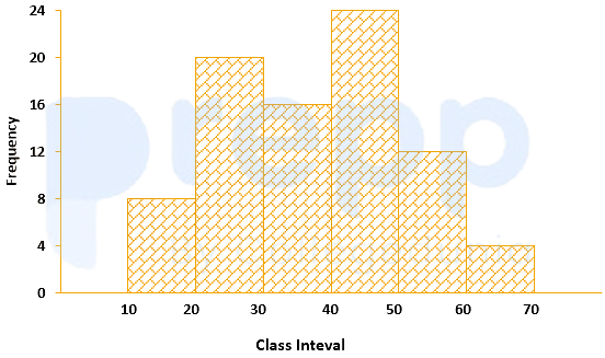
The approximated mean of this distribution is:
The annual vehicles production (in lacs) in india is given in the pie chart.
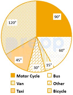
If the annual production of motor cycle is 1.80 lacs, the annual production of Bicycle is
The curve obtained by joining the points, whose x-coordinates are the upper limits of the class interval and y-coordinates are corresponding cumulative frequencies is called:
Which statement of the following is incorrect?
The variation among the observations of each specific class is known as:
For making frequency distribution, the number of classes used depends upon:
When the collected data is grouped with reference to time, we have
Mutual and unique variances among multiple factors can be embodied in a diagram that comprises overlapping circles. The diagram is known as:
The graphical representation of the time series is known as:
Which of the following is a method of collection of primary data?
Important Questions from Classification of Data
The class marks in a frequency table are given to be 5, 10, 15, 20, 25, 30, 35, 40, 45, 50. The class limits of the first five classes are
In a test in Mathematics, 20% of the students obtained “first class”. If the data are represented by a Pie-Chart, what is the central angle corresponding to “first class”?
The following table gives the monthly expenditure of two families:
Expenditure (in Rs.)
Items
Family A
Family B
Food
3,500
2,700
Clothing
500
800
Rent
1,500
1,000
Education
2,000
1,800
Miscellaneous
2,500
1,800
In constructing a pie diagram to the above data, the radii of the circles are to be chosen by which one of the following ratios?
In an examination, 40% of candidates got second class. When the data are represented by a pie chart, what is the angle corresponding to second class?
Following histogram shows certain frequency distribution against class intervals.
The approximated mean of this distribution is: