For a frequency distribution of a discrete variable, the diagram of less than type cumulative frequency is a
non-decreasing step function
Understanding the Cumulative Frequency Diagram for a Discrete Variable
The question asks about the graphical representation of the less than type cumulative frequency for a discrete variable. Let's break down the key concepts:
- Discrete Variable: A variable whose values can only take specific, distinct values, often integers (e.g., number of students, number of defects). There are gaps between possible values.
- Frequency Distribution: A table that shows the frequency (count) of each distinct value or range of values in a dataset.
- Cumulative Frequency (Less Than Type): For a given value of the variable, the cumulative frequency is the sum of the frequencies of all values that are less than or equal to that value.
Properties of Less Than Type Cumulative Frequency
Consider a discrete variable X with values \(x_1 < x_2 < x_3 < \dots < x_n\). Let the frequency of \(x_i\) be \(f_i\). The cumulative frequency (less than type) for \(x_i\) is given by:
\(CF(x_i) = f_1 + f_2 + \dots + f_i = \sum_{j=1}^{i} f_j\)
As we move from a smaller value \(x_i\) to a larger value \(x_{i+1}\), the cumulative frequency \(CF(x_{i+1})\) includes all the frequencies up to \(x_i\) plus the frequency of \(x_{i+1}\). Since frequencies (\(f_i\)) are non-negative, the cumulative frequency can either stay the same (if \(f_{i+1} = 0\)) or increase (if \(f_{i+1} > 0\)). It can never decrease.
Therefore, the cumulative frequency function for a less than type distribution is always non-decreasing.
Diagram of Cumulative Frequency for a Discrete Variable
When we plot the cumulative frequency against the value of the discrete variable, we plot points \((x_i, CF(x_i))\). Since the variable is discrete, the cumulative frequency only changes its value at the specific points \(x_1, x_2, \dots, x_n\). Between two consecutive distinct values \(x_i\) and \(x_{i+1}\), the cumulative frequency remains constant at \(CF(x_i)\) for any value greater than or equal to \(x_i\) and less than \(x_{i+1}\). This results in a graph that looks like a series of horizontal steps, with vertical jumps occurring at each value of the discrete variable where the frequency is non-zero.
A function whose graph consists of a series of horizontal steps is called a step function.
Because the cumulative frequency is non-decreasing and the changes occur in steps at discrete values, the diagram of the less than type cumulative frequency for a discrete variable is a non-decreasing step function.
| Feature | Discrete Variable CF Diagram (Less Than) |
|---|---|
| Nature of change | Changes occur only at specific variable values. |
| Graph shape | Horizontal steps with vertical jumps. |
| Direction | Never decreases (non-decreasing). |
A continuous function, in contrast, would have a graph that can be drawn without lifting the pen, implying smooth changes, which is not the case here due to the discrete nature of the variable.
Based on this analysis, the correct description for the diagram of the less than type cumulative frequency of a discrete variable is a non-decreasing step function.
Revision Table: Cumulative Frequency Diagrams
| Type of Variable | Cumulative Frequency Diagram (Less Than Type) |
|---|---|
| Discrete | Non-decreasing Step Function |
| Continuous | Non-decreasing Continuous Curve (Ogive) |
Additional Information: Ogive and Cumulative Frequency
The diagram representing cumulative frequencies is often called an Ogive. For discrete data, the ogive is typically a step function. For grouped continuous data, we usually plot the cumulative frequency against the upper class boundaries, and the points are joined by line segments, resulting in a curve (often smoothed) which is also a non-decreasing function, but continuous rather than a step function in its ideal representation.
Understanding whether a variable is discrete or continuous is crucial in determining the appropriate graphical representation for its cumulative frequency distribution.
Similar Questions
Following histogram shows certain frequency distribution against class intervals.
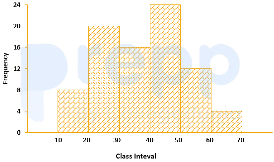
The approximated mean of this distribution is:
The annual vehicles production (in lacs) in india is given in the pie chart.
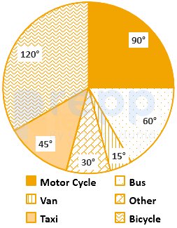
If the annual production of motor cycle is 1.80 lacs, the annual production of Bicycle is
For determination of mode and median graphically, one considers:
The curve obtained by joining the points, whose x-coordinates are the upper limits of the class interval and y-coordinates are corresponding cumulative frequencies is called:
The variation among the observations of each specific class is known as:
For making frequency distribution, the number of classes used depends upon:
When the collected data is grouped with reference to time, we have
Mutual and unique variances among multiple factors can be embodied in a diagram that comprises overlapping circles. The diagram is known as:
Which of the following is a method of collection of primary data?
The grouped data for the observation are
Class: 1-3 3-5 5-7 Frequency: 2 1 2 The population skewness
Important Questions from Classification of Data
The class marks in a frequency table are given to be 5, 10, 15, 20, 25, 30, 35, 40, 45, 50. The class limits of the first five classes are
In a test in Mathematics, 20% of the students obtained “first class”. If the data are represented by a Pie-Chart, what is the central angle corresponding to “first class”?
The following table gives the monthly expenditure of two families:
Expenditure (in Rs.)
Items
Family A
Family B
Food
3,500
2,700
Clothing
500
800
Rent
1,500
1,000
Education
2,000
1,800
Miscellaneous
2,500
1,800
In constructing a pie diagram to the above data, the radii of the circles are to be chosen by which one of the following ratios?
In an examination, 40% of candidates got second class. When the data are represented by a pie chart, what is the angle corresponding to second class?
Following histogram shows certain frequency distribution against class intervals.
The approximated mean of this distribution is: