Which one of the following is not correct?
Perimeters of the slices
Understanding Proportions in a Pie Diagram
A pie diagram, also known as a pie chart, is a circular statistical graphic divided into slices to illustrate numerical proportion. In a pie diagram, the entire circle represents the whole or 100% of the data, and each slice represents a proportion of that whole.
For a pie diagram to accurately represent the data, the size of each slice must be proportional to the value it represents. This proportionality is typically measured in several ways:
- Area of slices: The area of each sector (slice) is proportional to the value of the item it represents. A larger value corresponds to a larger area.
- Angles of slices: The angle subtended by each slice at the center of the circle is proportional to the value of the item. The sum of all central angles in a pie diagram is 360 degrees. The formula for the angle of a slice is:
\[ \text{Angle} = \left( \frac{\text{Value of item}}{\text{Total value}} \right) \times 360^\circ \]
- Lengths of the curved surface arcs of slices: The length of the arc of each slice is also proportional to the value of the item. The total circumference of the circle represents the total value. The formula for the arc length of a slice is:
\[ \text{Arc Length} = \left( \frac{\text{Value of item}}{\text{Total value}} \right) \times \text{Circumference} = \left( \frac{\text{Value of item}}{\text{Total value}} \right) \times 2\pi r \]
where \(r\) is the radius of the circle.
Analysing Pie Diagram Proportionality Options
Let's examine each option provided in the question about what the proportion of various items in a pie diagram is proportional to:
- Area of slices: As discussed above, the area of a slice is directly proportional to the value it represents. This is a fundamental principle of pie diagrams.
- Angles of slices: The central angle of a slice is directly proportional to the value it represents. This is also a fundamental principle and is often the method used to construct a pie diagram.
- Lengths of the curved surface arcs of slices: The arc length of a slice is directly proportional to the value it represents, as it is a fraction of the total circumference determined by the central angle.
- Perimeters of the slices: The perimeter of a pie diagram slice consists of the arc length and two radii. The formula for the perimeter of a slice is:
\[ \text{Perimeter of slice} = \text{Arc Length} + 2 \times \text{Radius} = \left( \frac{\text{Value of item}}{\text{Total value}} \right) \times 2\pi r + 2r \]
While the arc length part of the perimeter is proportional to the item's value, the \(2r\) part (the two straight edges) is constant for all slices in the same pie diagram, regardless of their value. Therefore, the total perimeter of the slice is not directly proportional to the value of the item. Two slices representing different proportions will have perimeters that are not in the same ratio as their values, because of the constant addition of \(2r\).
Identifying the Incorrect Statement
Based on the analysis, the proportion of various items in a pie diagram is proportional to the area of the slices, the angles of the slices, and the lengths of the curved surface arcs of the slices. It is *not* proportional to the perimeters of the slices.
Therefore, the statement that is not correct is that the proportion of various items in a pie diagram is proportional to the Perimeters of the slices.
Revision Table: Pie Diagram Proportionality
| Feature of Slice | Is it Proportional to Item's Proportion? | Reason |
|---|---|---|
| Area | Yes | Area of a sector is \( \frac{\theta}{360^\circ} \times \pi r^2 \). Since \( \theta \) is proportional, Area is proportional. |
| Central Angle | Yes | By definition and construction, the angle is calculated to be proportional to the value. |
| Arc Length | Yes | Arc length is \( \frac{\theta}{360^\circ} \times 2\pi r \). Since \( \theta \) is proportional, Arc Length is proportional. |
| Perimeter | No | Perimeter is Arc Length \( + 2r \). The \( 2r \) part is constant and prevents direct proportionality to the item's value. |
Additional Information on Data Visualization
Pie diagrams are useful for showing the relative proportions of a whole, especially when the number of categories is small. However, they can be difficult to read accurately when comparing the sizes of slices that are very similar in proportion, or when there are many categories.
Other common data visualization methods include:
- Bar graphs: Useful for comparing quantities across different categories. The length of the bars is proportional to the values they represent.
- Histograms: Used to show the distribution of a continuous variable. The area of each bar is proportional to the frequency in that interval.
- Line graphs: Primarily used to show trends over time or another continuous variable.
- Scatter plots: Used to show the relationship between two numerical variables.
Each type of chart has its strengths and weaknesses for representing different types of data and highlighting specific aspects of the data.
Similar Questions
How much less amount is allocated to A and C together as compared to B, D and E together?
How much amount will be increased on A if the total budget is increased by three times?
A pie chart is drawn for the following data:
Sector
Percentage
Agriculture and Rural development
12.9
Irrigation
12.5
Energy
27.2
Industry and Minerals
15.4
Transport and communication
15.9
Social services
16.1
What is the angle (approximately) subtended by the social services sector at the centre of the circle?
The pie diagrams on the monthly expenditure of two families A and B are drawn with radii of two circles taken in the ratio 16 : 9 to compare their expenditures.
Which one of the following is the appropriate data used for the above mentioned pie diagram?In a pie diagram, there are four slices with angles 150°, 90°, 60° and 60°. A new pie diagram is formed by deleting one of the slices having angle 60° in the given pie diagram. In the new pie diagram
There are two categories of employees in 2019 whose total strength remained the same in 2020. What are these two categories ?
In which one of the following categories of employees, the percentage change in number of employees in 2020 was maximum as compared to 2019?
What was the percentage increase of category-E employees in 2020 as compared to that in 2019 ?
There are two categories of employees whose strength increased/decreased by same percentage in 2020. What are the two categories ?
Important Questions from Pie Chart
Study the following pie-charts carefully to answer the questions.
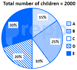
If 70 percent children from village D go to school then what is the number of children attending school from village D ?
Study the following pie-charts carefully to answer the questions.Percentage break-up of number of children in five different villages
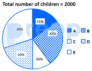
What is the respective ratio of total number of children from village A to village C ?
Study the following pie-charts carefully to answer the questions.Percentage break-up of number of children in five different villages
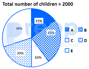
What is the total number of children in villages B and E ?
Study the chart and answer the question based, on the pie chart.The pie chart is given below shows expenditures incurred by a family on various items and savings in a month. Savings of the family is ₹ 8,000 in a month.
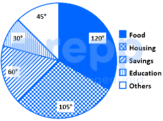
What is the total expenditure of the family for the month?
Study the chart and answer the question based, on the pie chart.The pie chart given below shows expenditures incurred by a family on various items and savings in a month. Savings of the family is ₹ 8,000 in a month.
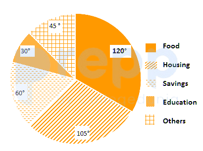
How much more amount is spent on food than on housing?