A pie chart is drawn for the following data: Sector Percentage Agriculture and Rural development 12.9 Irrigation 12.5 Energy 27.2 Industry and Minerals 15.4 Transport and communication 15.9 Social services 16.1 What is the angle (approximately) subtended by the social services sector at the centre of the circle?
58°
Calculating Sector Angles in a Pie Chart
A pie chart is a circular graph divided into sectors, where each sector represents a proportion of the whole. The entire circle represents 100% of the data, and it also corresponds to a total angle of 360 degrees at the center.
Understanding Pie Chart Proportions
In a pie chart:
- The complete circle represents the total value or 100% of the data.
- The total angle at the center of the circle is always 360 degrees.
- Each sector's angle is proportional to the percentage it represents out of the total 100%.
To find the angle subtended by a sector at the center, we convert the sector's percentage into a fraction of the total 360 degrees.
Data for Social Services Sector
The question provides data for various sectors in a table:
Sector | Percentage |
Agriculture and Rural development | 12.9 |
Irrigation | 12.5 |
Energy | 27.2 |
Industry and Minerals | 15.4 |
Transport and communication | 15.9 |
Social services | 16.1 |
From this table, we see that the 'Social services' sector represents 16.1% of the total data.
Formula for Calculating Sector Angle
The angle for any sector in a pie chart can be calculated using the following formula:
\text{Angle of Sector} = \left( \frac{\text{Percentage of Sector}}{100} \right) \times 360^\circ
Step-by-Step Calculation for Social Services Angle
Let's calculate the angle for the Social services sector using its percentage:
- Identify the percentage for the Social services sector: This is 16.1%.
- Substitute the percentage into the formula:
\text{Angle} = \left( \frac{16.1}{100} \right) \times 360^\circ
- Perform the calculation:
\text{Angle} = 0.161 \times 360^\circ
\text{Angle} = 57.96^\circ
Approximation of the Angle
The calculated angle for the Social services sector is 57.96 degrees. The question asks for the angle approximately. Looking at the options provided, 57.96 degrees is closest to 58 degrees.
Therefore, the approximate angle subtended by the social services sector at the centre of the circle is 58 degrees.
Revision Table: Pie Chart Formulas
Here are some key formulas used with pie charts:
| Concept | Formula |
| Angle from Percentage | \(\text{Angle} = \left( \frac{\text{Percentage}}{100} \right) \times 360^\circ\) |
| Percentage from Angle | \(\text{Percentage} = \left( \frac{\text{Angle}}{360^\circ} \right) \times 100\) |
| Value from Percentage | \(\text{Value} = \left( \frac{\text{Percentage}}{100} \right) \times \text{Total Value}\) |
Additional Information: Data Representation Charts
Pie charts are useful for showing parts of a whole. Other common types of data representation charts include:
- Bar Charts: Used to compare different categories. The height of each bar represents the value for that category.
- Line Graphs: Used to show trends over time or sequential data. Points are plotted on a grid and connected by lines.
- Histograms: Similar to bar charts but used for continuous data grouped into bins.
- Scatter Plots: Used to show the relationship between two variables.
Choosing the right type of chart depends on the kind of data you have and what you want to illustrate.
Similar Questions
How much less amount is allocated to A and C together as compared to B, D and E together?
How much amount will be increased on A if the total budget is increased by three times?
The pie diagrams on the monthly expenditure of two families A and B are drawn with radii of two circles taken in the ratio 16 : 9 to compare their expenditures.
Which one of the following is the appropriate data used for the above mentioned pie diagram?Which one of the following is not correct?
The proportion of various items in a pie diagram is proportional to theIn a pie diagram, there are four slices with angles 150°, 90°, 60° and 60°. A new pie diagram is formed by deleting one of the slices having angle 60° in the given pie diagram. In the new pie diagram
There are two categories of employees in 2019 whose total strength remained the same in 2020. What are these two categories ?
In which one of the following categories of employees, the percentage change in number of employees in 2020 was maximum as compared to 2019?
What was the percentage increase of category-E employees in 2020 as compared to that in 2019 ?
There are two categories of employees whose strength increased/decreased by same percentage in 2020. What are the two categories ?
Important Questions from Pie Chart
Study the following pie-charts carefully to answer the questions.
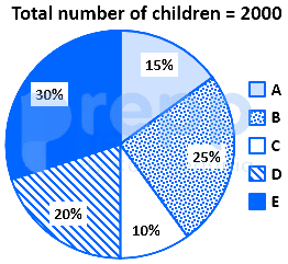
If 70 percent children from village D go to school then what is the number of children attending school from village D ?
Study the following pie-charts carefully to answer the questions.Percentage break-up of number of children in five different villages
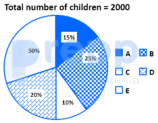
What is the respective ratio of total number of children from village A to village C ?
Study the following pie-charts carefully to answer the questions.Percentage break-up of number of children in five different villages
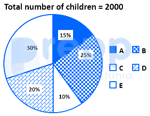
What is the total number of children in villages B and E ?
Study the chart and answer the question based, on the pie chart.The pie chart is given below shows expenditures incurred by a family on various items and savings in a month. Savings of the family is ₹ 8,000 in a month.
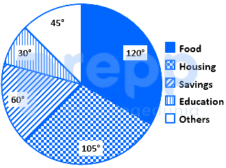
What is the total expenditure of the family for the month?
Study the chart and answer the question based, on the pie chart.The pie chart given below shows expenditures incurred by a family on various items and savings in a month. Savings of the family is ₹ 8,000 in a month.
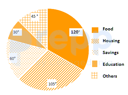
How much more amount is spent on food than on housing?