
The percentage increase in the population is highest as compared to that of the previous year in the year: Population 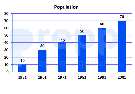
1961
Calculation:
Apparently from the graph, we can interpret that the bar graph touched 10 and 30 for 1951 and 1961 respectively.
Here, the gap is 20.
For the rest of the chart, the gap is strictly 10 in an upward fashion.
Hence, in 1961 the population increase% is the highest.
∴ The percentage increase in the population is the highest as compared to that of the previous year in the year 1961.
Similar Questions
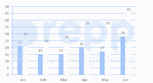
The given data shows the registration of bikes and total vehicles (in thousands) for 6 months in 2017 in City X.
Note: In the chart, the first number represents bikes and the second number represents total vehicles.
Based on the given data, the increase in the registration of vehicles other than bikes in April 2017 in comparison of Jan 2017 is _______.
If the total number of bikes sold in 2009 was 10000 how many more yellow bikes were sold than green ones?
The bar graph shows the population density of 6 countries in 2000 and 2010.
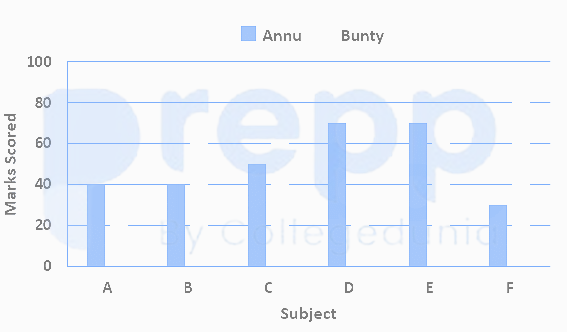
If the population of country B is 10 million in 2000 and the population of country D is 6 million in 2010, how much more is the area of country B than the area of country D, where population density is measured as the number of people per 100 square kilometers.The bar graph shows the marks scored by Annu and Bunty in their exam, which had 6 papers of 100 marks each. If Bunty had scored 25% less in Paper C and 10 marks more in paper A, then he would have scored how much more than Annu in the exam?
Based on the given data, in April 2017, the number of vehicles other than bikes registered is:
Which fruit among the given below was chosen by the least students?
If the total number of bikes sold in 2009 was 50000, then by what number was the sales of white bikes less than that of yellow and red bikes put together?
If the total number of bikes sold in 2009 was 15000, how many more red bikes were sold than black ones?
If the total number of bikes sold in 2009 was 6000, then according to the given data, bikes of which colour were sold equally?
What is the total number of students in the class?
Important Questions from Bar Graph
Sales of books from four shops (B1, B2, B3, B4) in thousands are given as below. Study the graph and answer the following questions.
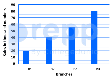
If each shop can increases the sales of books by 10%,then the total number of books(in thousands) soldby all the shop are:
The given pie chart shows the degree-wise break-up of the expenditure of a family in a month. The total expenditure of the family is ₹43,200.
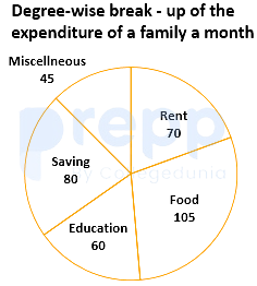
By what percentage is the expenditure on education and rent taken together more than the expenditure on food (correct to two decimal places)?
Which country has the second largest population density?
For the second show the number of audience in Screen 3 is how much more than the number of audience in Screen 1?
The percentage increase in the total production of cars from 2014 to 2018 was



