The given Line graph Data Interpretation Chart shows the sales of shoes (in thousands) from six stores in six different cities Kolkata, Patna, Dhanbad, Ranchi, Asansol and Gaya during three consecutive years 2020, 2021 and 2022:
2020 2021 2022 Kolkata 350 200 250 Patna 200 250 300 Dhanbad 150 160 280 Ranchi 100 120 270 Asansol 100 150 220 Gaya 80 100 200
Understanding the Sales Data
The question requires us to calculate the total number of shoes sold by the Kolkata store, Patna store, and Ranchi store combined, over the three years (2020, 2021, and 2022). The sales figures are provided in thousands.
First, let's extract and organize the sales data for these specific stores from the given information:
| Store | 2020 Sales (Thousands) | 2021 Sales (Thousands) | 2022 Sales (Thousands) |
|---|---|---|---|
| Kolkata | 350 | 200 | 250 |
| Patna | 200 | 250 | 300 |
| Ranchi | 100 | 120 | 270 |
Calculating Total Sales for Each Store
Next, we sum the sales for each store across the three years:
- Kolkata Store Total Sales: We add the sales figures for Kolkata for the years 2020, 2021, and 2022. $ \text{Kolkata Sales} = 350 + 200 + 250 = 800 \text{ thousand} $
- Patna Store Total Sales: We add the sales figures for Patna for the years 2020, 2021, and 2022. $ \text{Patna Sales} = 200 + 250 + 300 = 750 \text{ thousand} $
- Ranchi Store Total Sales: We add the sales figures for Ranchi for the years 2020, 2021, and 2022. $ \text{Ranchi Sales} = 100 + 120 + 270 = 490 \text{ thousand} $
Calculating Combined Sales for Stores
Finally, to find the total sales for Kolkata, Patna, and Ranchi stores combined over the three years, we sum the individual store totals:
$ \text{Total Combined Sales} = (\text{Kolkata Sales}) + (\text{Patna Sales}) + (\text{Ranchi Sales}) $ $ \text{Total Combined Sales} = 800 + 750 + 490 $ $ \text{Total Combined Sales} = 2040 \text{ thousand} $The calculated total sales figure is 2040 thousand. Based on the provided options, the third option aligns with the given correct answer.
Similar Questions
- What is the average number of users of Alpha and Gamma across all ten cities together?
- What approximate percent less are the total number of users of Alpha, Beta and Gamma together in city 'B' compared to the total number of users of Alpha, Beta and Gamma together in city 'H'?
- What is the total number of users of Beta and Gamma across all ten cities together?
- The number of users of Alpha and Beta together in city 'A' is what percent of the number of users of Beta and Gamma together in 'E'?
- What is the ratio of the number of users of Alpha, Beta and Gamma together in city 'D' to the number of users of Beta and Gamma together in city 'I'?
- The total number of students in Std. 6 and Std. 9 together is approximately what percentage more than that of the total number of students in Std. 10?
- The total number of boys in Std. 8 is "x" and the total number of boys in Std. 9 is "x + 40". If the total number of girls in Std. 8 and Std. 9 together is 120, then find the value of "x".
- What is the difference between the total number of students in Std. 7 and Std. 8 together to that of the total number of students in Std. 9 and Std. 10 together?
- If in Std. 6, the ratio of boys to girls is 6:5 and the total number of girls in Std. 6 is 50 less than that of the total number of girls in Std. 7, then find the ratio of the total number of boys in Std. 6 to Std. 7.
- If in 2024, the total number of students in Std. 6 and Std. 7 is increased by 10% each and the total number of students in Std. 10 is decreased by 20%, then what is the difference between the total number of students in Std. 6 and 7 together in 2023 to that of the total number of students in Std. 10 in 2024 ?
Important Questions from Data Interpetation (Notes)
- Answer the question on the basis of the informations given below :
Three different climatic factors for four cities in India are shown in the following table :City Average Annual Rainfall (in mm) Average Annual Temperature (in degree centigrade) Maximum humidity in the year A 75 21 126 B 86 17 130 C 68 17 160 D 70 24 150
If humidity factor is defined as average annual rainfall divided by average annual temperature for the cities, the humidity factor is highest for which city ? The pie charts show placement percentages of graduates of five different subjects out of the total campus placements for two consecutive years.
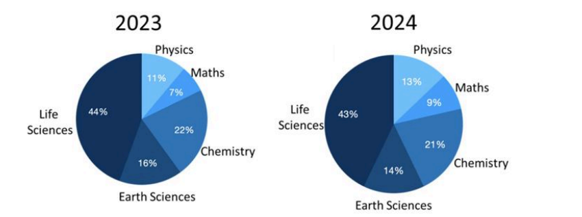
In the year 2024, the number of Maths students who got placed was the double that of the previous year. Which of the following is the closest to the percentage change in the number of Life Sciences students placed in the year 2024?The following ternary figure shows the marks obtained by students A, B and C in an exam of 100 marks. Here, C received 10 marks in Physics, 50 marks in Chemistry and 40 marks in Mathematics.
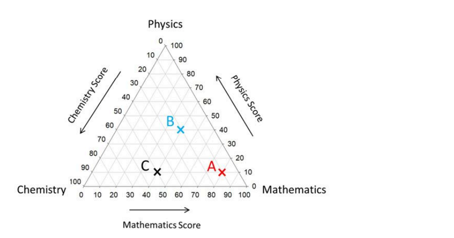
Which one of the following is CORRECT?The Sankey diagram shows food preferences of males and females. The widths of the bands are proportional to numbers of persons opting for a given food item.
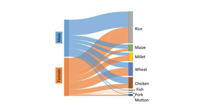
Which one of the following is an INCORRECT statement about the food preferences?The following figure shows densities and masses of five objects (A to E).
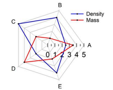
The object with the largest volume is _____