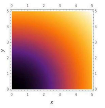
The Sankey diagram shows food preferences of males and females. The widths of the bands are proportional to numbers of persons opting for a given food item.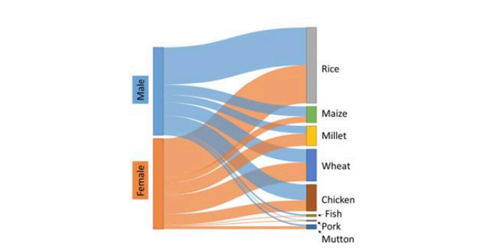
Which one of the following is an INCORRECT statement about the food preferences?
The Sankey diagram provided illustrates the food preferences among males and females, with the width of each band representing the number of persons opting for each food item.
To determine the incorrect statement from the given options, let's analyze each one:
- Chicken is the second most preferred food in males.
- In the diagram, after examining the widths, rice appears the widest, and chicken can be identified as the second widest for males.
- This statement is correct.
- As compared to males, more females prefer wheat.
- The diagram shows that the band for wheat is wider for females than for males.
- This statement is correct.
- As compared to males, more females prefer mutton and millet.
- The bands for mutton and millet are wider for females than for males.
- This statement is correct.
- Fewer females prefer rice than the total number of males preferring maize and millet.
- Analyzing the diagram, the band for females preferring rice is relatively wide.
- The summed widths for males preferring maize and millet do not exceed the female rice preference.
- This statement is incorrect.
Conclusion: The statement "Fewer females prefer rice than the total number of males preferring maize and millet" is incorrect based on the analysis of the Sankey diagram.
Important Questions from Data Interpetation (Notes)
- Answer the question on the basis of the informations given below :
Three different climatic factors for four cities in India are shown in the following table :City Average Annual Rainfall (in mm) Average Annual Temperature (in degree centigrade) Maximum humidity in the year A 75 21 126 B 86 17 130 C 68 17 160 D 70 24 150
If humidity factor is defined as average annual rainfall divided by average annual temperature for the cities, the humidity factor is highest for which city ? The pie charts show placement percentages of graduates of five different subjects out of the total campus placements for two consecutive years.
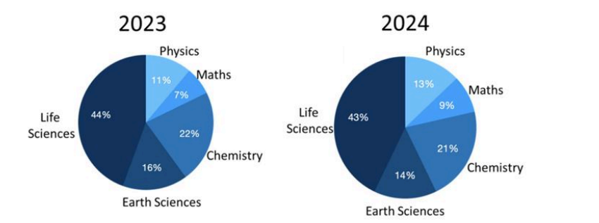
In the year 2024, the number of Maths students who got placed was the double that of the previous year. Which of the following is the closest to the percentage change in the number of Life Sciences students placed in the year 2024?The following ternary figure shows the marks obtained by students A, B and C in an exam of 100 marks. Here, C received 10 marks in Physics, 50 marks in Chemistry and 40 marks in Mathematics.
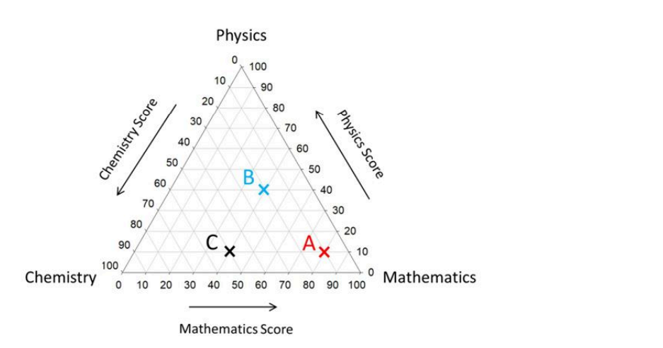
Which one of the following is CORRECT?The following figure shows densities and masses of five objects (A to E).
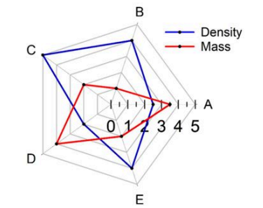
The object with the largest volume is _____The following plot shows temperature as a function of x and y. Along which path is the temperature change minimum?