
The population of a town over the years 2000-2007 is shown in the given figure. It can be inferred that during 2000-2007,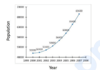
The question requires us to analyze the rate of population growth from 2000 to 2007. Let's examine the data in the provided graph.
From the graph, the population values are:
- 2000: 50,000
- 2001: 50,400
- 2002: 51,600
- 2003: 53,600
- 2004: 56,400
- 2005: 60,000
- 2006: 64,400
- 2007: 69,600
We first calculate the annual increases in population:
- 2001 - 2000: 50,400 - 50,000 = 400
- 2002 - 2001: 51,600 - 50,400 = 1,200
- 2003 - 2002: 53,600 - 51,600 = 2,000
- 2004 - 2003: 56,400 - 53,600 = 2,800
- 2005 - 2004: 60,000 - 56,400 = 3,600
- 2006 - 2005: 64,400 - 60,000 = 4,400
- 2007 - 2006: 69,600 - 64,400 = 5,200
Next, we observe the increments in these annual increases:
- 2002 increase - 2001 increase: 1,200 - 400 = 800
- 2003 - 2002: 2,000 - 1,200 = 800
- 2004 - 2003: 2,800 - 2,000 = 800
- 2005 - 2004: 3,600 - 2,800 = 800
- 2006 - 2005: 4,400 - 3,600 = 800
- 2007 - 2006: 5,200 - 4,400 = 800
The increments of 800 per year indicate that the rate of increase in the rate of increase of the population is consistent and linear.
Therefore, the correct answer is: the rate of increase of the rate of increase of the population increased linearly.
Important Questions from Data Interpetation (Notes)
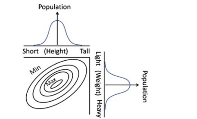
Contours in the bivariate (weight, height) graph connect regions of approximately equal popula-tions. Which of the following interpretations is correct?
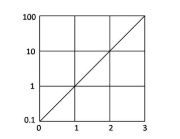
The function $f(x)$ is plotted against $x$ as shown. Extrapolate and find the value of the function at $x = -1$.
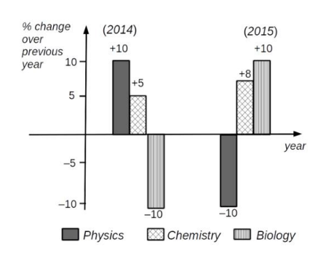
Which of the following inferences can be drawn from the above graph?
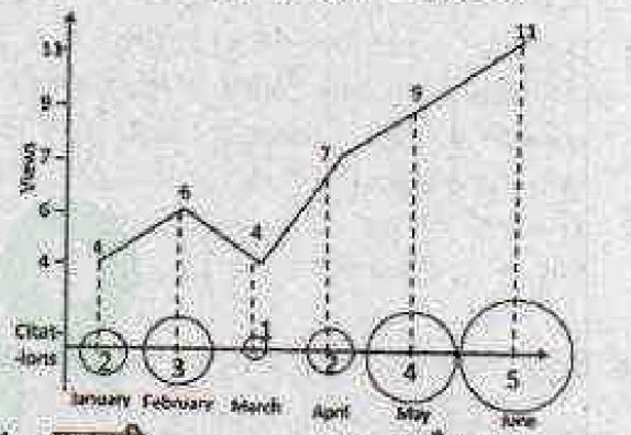
Number of times a research paper is viewed and cited is shown in the plot. In which month was the percentage increase in citation more than the double of the percentage increase in view?
- There are two examinations, A and B in a subject which are evaluated out of 30 and 70 marks, respectively. In order to pass the course the student has to get at least 40 % in total and at least 40 % in B. The following are the marks of the students $S_1$ to $S_4$.
Students A B $S_1$ 12 28 $S_2$ 10 29 $S_3$ 16 27 $S_4$ 05 29
The only student/s to have passed is/are


