
Contours in the bivariate (weight, height) graph connect regions of approximately equal popula-tions. Which of the following interpretations is correct?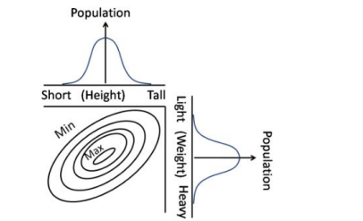
The given graph is a contour plot representing the distribution of a population according to their height and weight. The contours connect regions of approximately equal population. Let's analyze the options:
- There is no correlation between height and weight of the population:
The contour lines suggest a relationship between height and weight. If there were no correlation, the contours would appear more random, without any particular trend.
- Heavier individuals are likely to be taller than lighter individuals:
While it might be a general assumption that taller individuals tend to be heavier, nothing in the contour plot suggests that this is a definitive conclusion, as the contour peaks are not aligned towards heavier weights for taller individuals.
- Taller and lighter individuals are more in number than taller and heavier individuals:
The contours show higher concentrations towards lighter weights, even as height increases. This suggests that there are more taller and lighter individuals compared to taller and heavier ones. Hence, this option is correct.
- There are no individuals of medium weight and medium height:
The contour plot does not support this conclusion as it shows the distribution of the population, including individuals of medium weight and height.
Therefore, the correct interpretation is that taller and lighter individuals are more in number than taller and heavier individuals.
Important Questions from Data Interpetation (Notes)
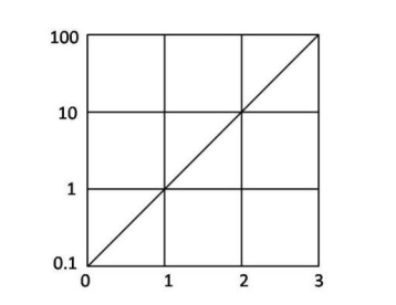
The function $f(x)$ is plotted against $x$ as shown. Extrapolate and find the value of the function at $x = -1$.
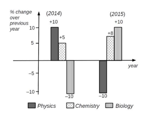
Which of the following inferences can be drawn from the above graph?
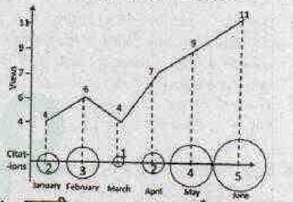
Number of times a research paper is viewed and cited is shown in the plot. In which month was the percentage increase in citation more than the double of the percentage increase in view?
- There are two examinations, A and B in a subject which are evaluated out of 30 and 70 marks, respectively. In order to pass the course the student has to get at least 40 % in total and at least 40 % in B. The following are the marks of the students $S_1$ to $S_4$.
Students A B $S_1$ 12 28 $S_2$ 10 29 $S_3$ 16 27 $S_4$ 05 29
The only student/s to have passed is/are The graph depicts the petrol prices (in Rs. per litre) for the months April, May and June.
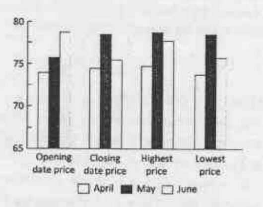
Pick the INCORRECT statement.


