
Which one of the following, drawn on a linear scale, represents the circle shown in the figure above? Select the CORRECT option 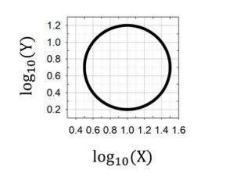
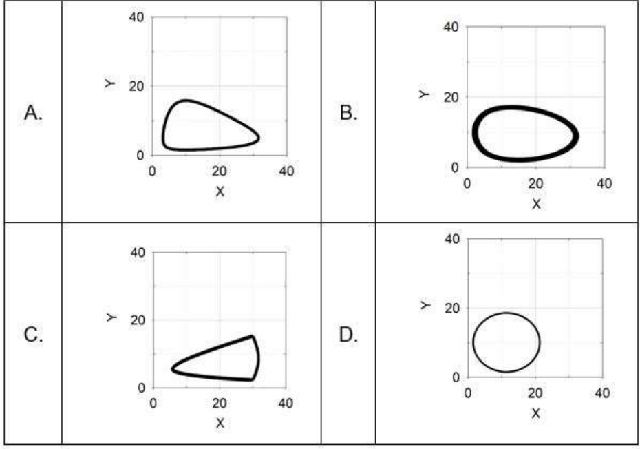
To determine which graph on a linear scale represents the given circle plotted on a logarithmic scale, we need to understand the transformation from logarithmic to linear scale.
The given graph is plotted in a logarithmic scale as shown below:
In the given image, axes are labeled as \(\log_{10}(X)\) and \(\log_{10}(Y)\). The figure is a circle, which suggests a constant ratio of \(X\) to \(Y\) when transformed.
To convert from log scale to linear scale:
- If \(P = \log_{10}(X)\), then \(X = 10^P\).
- If \(Q = \log_{10}(Y)\), then \(Y = 10^Q\).
In a logarithmic plot, a circle implies an equation of form:
\((\log_{10}(X) - a)^2 + (\log_{10}(Y) - b)^2 = r^2\)
Transforming this to a linear scale results in a geometrical figure like a geometric progression or ratio, potentially a distorted circle or ellipse depending on the axis scales.
Now, consider the given options in the linear scale:
Among the options, option A resembles a distorted circle (or ellipse), which aligns well with the transformation behavior from a logarithmic circle. The other shapes (represented in options B, C, and D) do not maintain the circle-like proportion when transformed.
Thus, the correct answer is:
A
Important Questions from Data Interpetation (Notes)
The population of a town over the years 2000-2007 is shown in the given figure.
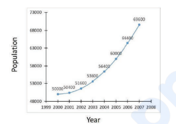
It can be inferred that during 2000-2007,
The areas (in km²) under forests in four countries A, B, C and D for the years 2014 and 2024 are shown in the given bar chart:
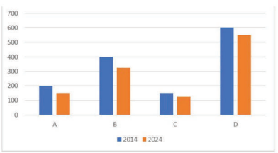
The minimum percentage of deforestation during 2014-2024 was in country- Find the average amount collected from the sales of Bengali dishes, Punjabi dishes and Gujarati dishes.
- The amount collected by selling Chinese dishes is approximately what percentage more than the amount collected by selling Bengali dishes?
- The number of questions asked in shift I from the topic Profit-Loss is what percent more than the number of questions asked in shift II from the topic Average?


