
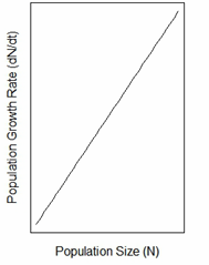
To determine which graph represents the relationship between population size (N) and population growth rate (\(dN/dt\)) for a population showing exponential growth, we need to understand the principles of exponential growth in population ecology.
Exponential growth occurs when the resources in the environment are unlimited and conditions do not restrict the population's growth. This growth can be described by the exponential growth equation:
\(dN/dt = rN\)
Where:
- \(dN/dt\) is the population growth rate.
- \(r\) is the intrinsic rate of natural increase.
- \(N\) is the population size.
This equation implies that the population growth rate (\(dN/dt\)) is directly proportional to the population size (N). As the population size increases, the growth rate also increases.
In graphical terms, this relationship is depicted as a straight line that passes through the origin and shows a positive slope. This is because as the population size increases, the growth rate increases linearly with it.
Now, let's evaluate the options:
- : This appears to show no relationship or possibly a plateau, which does not correspond to exponential growth.
- : This graph shows a straight line passing through the origin with a positive slope, indicating a direct proportional relationship between N and \(dN/dt\). This is characteristic of exponential growth.
- : This graph likely represents logistic growth, where the growth rate eventually decreases as the population approaches carrying capacity.
- : This graph is not consistent with the direct linear relationship required for exponential growth.
Therefore, the correct graph that represents the relationship between population size (N) and population growth rate (\(dN/dt\)) for a population showing exponential growth is: 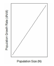
Important Questions from Population growth curves
- A flask containing nutrient-rich media is seeded with 100 isogenic bacteria. Assuming that no bacteria die in the flask, after approximately how many generations will the population reach a size of $10^5$?
Population growth of a species can be modelled as $$ \frac{dN(t)}{dt} = rN(t)\left(1 - \frac{N(t)}{K}\right) $$ where $N(t)$ is the population size at time $t$; $r$ is the growth rate; and $K$ is the carrying capacity of the environment.
For $K = 9000$, $\frac{dN(t)}{dt}$ is maximized at $N =$ _____
(Answer in integer)
- The population size at which net recruitment is the highest is also when the greatest amount can be harvested, while ensuring the long-term survival of the population. The amount harvested at this population size is known as
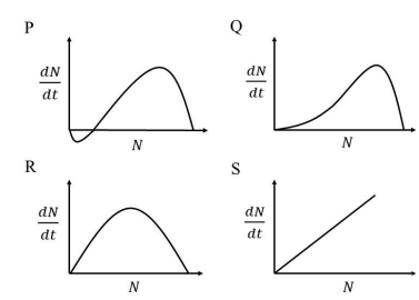
The graphs shown represent the relationship between population size ($N$) and population growth rate ($\frac{dN}{dt}$). Which one of the following growth curves represents a density-dependent population that experiences a strong Allee effect?
Overfishing reduced food availability for sea lions in California, causing a decline in their population size. In 1972, under the US Endangered Species Act, fishing was banned from sea lion foraging areas. Subsequently, the population of sea lions increased in a logistic form as shown in the figure.
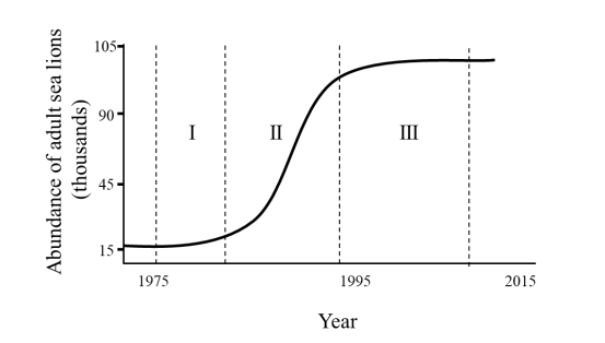
The per capita growth rate is highest in the interval __________ and the population growth rate is highest in the interval __________


