
The graph given below indicates the changes in key policy rates made by the Central Bank several times in a year: Which one of the following can be the most likely reason for the Central bank for such an action?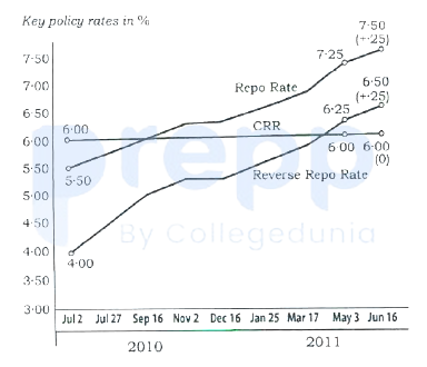
Anti-inflationary stance
Calculations:
From July '2' to June '16' it is almost one year. In this duration repo rate and reverse repo rate is going to increase continuously Wherever CRR is fixed. This only happens to control the inflation in the market. So whenever the central bank resists the policy rate, it is a way to suck out liquidity from the system. Normally this is due to the central bank expectation of rising inflation. Hence a continuously rising repo rate indicates an anti-inflationary stance.
∴ Option 4 is correct
Important Questions from Bar Graph and Line Graph
The table given below shows the cost price and value of profit of 6 articles.
Articles Cost price Profit D 700 200 E 600 150 F 400 300 G 500 400 H 300 250 I 800 350 Which of the following statement is NOT correct?
I. The profit of D, E and F is 30.63 percent of the cost price of G, H and I.
II. The ratio of total cost price to the total profit is 1 ∶ 2.
A ________ is often drawn as a guide, so that a frequency polygon can be drawn over the top.
The table given below shows the cost price and selling price of 5 different articles.
Article Cost price Selling price A 500 600 B 700 750 C 600 800 D 400 700 E 300 800 What is the ratio of total cost price to total selling price of all articles?
The bar chart given below shows the number of boys and girls in 5 schools.
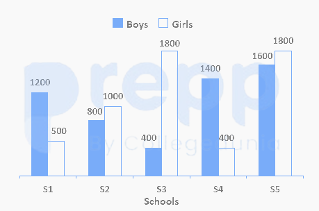
If the number of boys in school S6 are 30 percent more than the number of girls in school S1, then number of girls in schools S3 and S4 is what percentage of number of boys in schools S6 and S1 ? (correct to two decimal places)
The given histogram shows the heights of 232 students of an athletic club and their numbers.
Study the histogram carefully and answer the questions that follows.
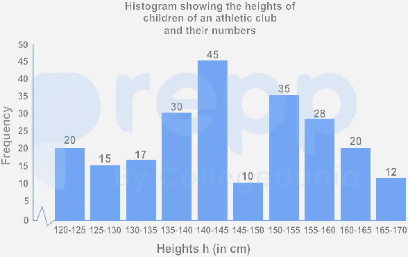
If the histogram is to be presented by a line diagram, what would be the starting point and the end point of the line diagram?


