A ________ is often drawn as a guide, so that a frequency polygon can be drawn over the top.
Histogram
In the field of statistics and data visualization, various graphical representations are used to display data distributions. One common method is the frequency polygon, which helps to show the shape of the distribution of a dataset. To draw a frequency polygon effectively and accurately, another common graphical tool serves as a fundamental guide.
Histogram: The Guide for Frequency Polygons
A frequency polygon is a graph that uses line segments connected to points plotted at the midpoints of class intervals, at heights corresponding to the frequencies of those intervals. It provides a visual representation of the shape of a distribution, similar to a histogram, but often smoother and more easily comparable across different datasets.
To accurately construct a frequency polygon, especially when dealing with grouped frequency distributions, a histogram is often drawn first. Here's why:
- A histogram is a bar graph that represents the frequency distribution of a set of continuous data. The bars are drawn adjacent to each other, indicating continuous data. The width of each bar represents the class interval, and the height represents the frequency of observations within that interval.
- When drawing a frequency polygon, points are plotted at the midpoints (or class marks) of the top of each bar of the histogram. These midpoints represent the central value of each class interval.
- The frequency polygon is then formed by connecting these midpoints with straight line segments. To close the polygon, points are typically added to the horizontal axis at the midpoints of the class intervals immediately preceding the first class and immediately following the last class, with a frequency of zero.
Therefore, the histogram provides the necessary framework and visual reference for determining where the points of the frequency polygon should be placed. It acts as an underlying structure that defines the class intervals and their corresponding frequencies, ensuring the frequency polygon accurately reflects the data's distribution.
Why Other Options Are Not the Primary Guide
- Frequency: While frequency is the data plotted on the vertical axis (Y-axis) of both a histogram and a frequency polygon, "frequency" itself is a measure, not a graphical guide for drawing the polygon.
- Cumulative Frequency: A cumulative frequency graph (also known as an ogive) plots cumulative frequencies against the upper boundaries of class intervals. It's used to determine things like medians and quartiles, but it is not directly used as a guide for drawing a frequency polygon.
- Rectangle: A rectangle is the basic shape used to form the bars of a histogram. While histograms are made of rectangles, "rectangle" itself is too general and does not refer to the complete statistical graph that serves as the guide.
In summary, the histogram serves as the foundational visual aid. By plotting the midpoints of the top of each bar in the histogram and connecting them, the frequency polygon can be accurately constructed to visualize the data distribution.
Important Questions from Bar Graph and Line Graph
The table given below shows the cost price and value of profit of 6 articles.
Articles Cost price Profit D 700 200 E 600 150 F 400 300 G 500 400 H 300 250 I 800 350 Which of the following statement is NOT correct?
I. The profit of D, E and F is 30.63 percent of the cost price of G, H and I.
II. The ratio of total cost price to the total profit is 1 ∶ 2.
The table given below shows the cost price and selling price of 5 different articles.
Article Cost price Selling price A 500 600 B 700 750 C 600 800 D 400 700 E 300 800 What is the ratio of total cost price to total selling price of all articles?
The bar chart given below shows the number of boys and girls in 5 schools.
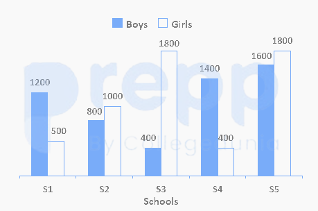
If the number of boys in school S6 are 30 percent more than the number of girls in school S1, then number of girls in schools S3 and S4 is what percentage of number of boys in schools S6 and S1 ? (correct to two decimal places)
The given histogram shows the heights of 232 students of an athletic club and their numbers.
Study the histogram carefully and answer the questions that follows.
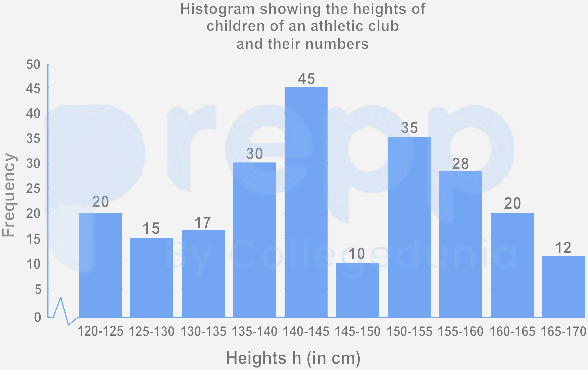
If the histogram is to be presented by a line diagram, what would be the starting point and the end point of the line diagram?
Directions:
These data are based on the bar graph and line graph.
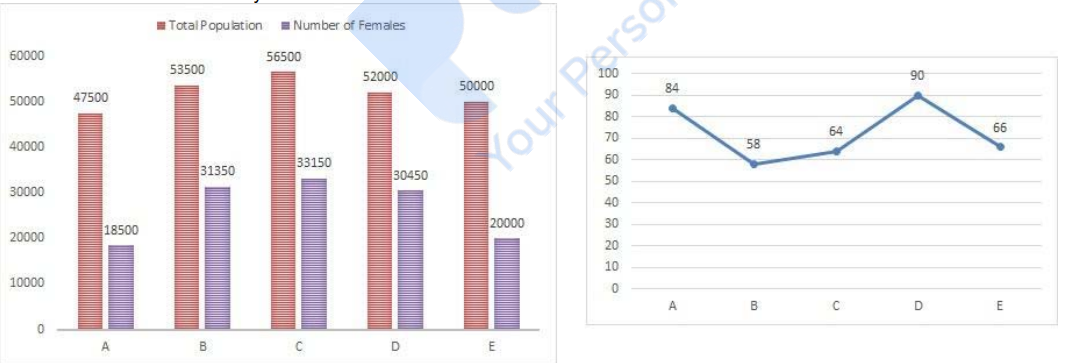
The following bar graph gives the total population of five cities(A, B, C, D and E) and number of females in the cities.
The following line graph gives the percentage of literates among females for each cities
Find the number of males in city B.