
A graph that displays data that changes Continuously over periods of time is-
line graph
Line Graph for Continuous Data Visualization
A line graph is specifically designed to display data that changes continuously over periods of time. This type of graph is highly effective for showing trends, patterns, and fluctuations of data points as they evolve over an interval, making it an ideal choice for time-series data.
Understanding Continuous Data Changes
When data changes continuously over periods of time, it means the variable being measured can take any value within a range and is typically recorded at consistent intervals or in a continuous flow. A line graph connects individual data points with lines, visually representing this uninterrupted progression.
- Each point on a line graph represents a data value at a specific moment or interval in time.
- The connecting lines between these points help in visualizing the rate of change and the overall trend of the data.
- For example, tracking stock market prices over a day, monitoring temperature changes throughout a month, or observing a company's sales performance over several quarters are all scenarios where a line graph provides clear insights into how data changes continuously over periods of time.
Why Other Graph Types are Not Ideal for Continuous Time Data
It's important to differentiate why the other options are not the best fit for data that changes continuously over periods of time:
- Bar Graph: A bar graph is primarily used for comparing discrete categories or distinct values. While it can show changes over time, it presents data in separate bars, which doesn't convey the smooth, continuous flow that a line graph offers. For instance, comparing the total sales of different products in a single month.
- Pie Chart: A pie chart illustrates parts of a whole, showing proportions or percentages of a total sum. It is not used to display data that changes over time or continuous trends. An example would be showing the percentage breakdown of expenses in a budget.
- Histogram: A histogram displays the frequency distribution of continuous data by dividing the data into "bins" or intervals and showing how many data points fall into each interval. While it deals with continuous data, its main purpose is to show the distribution and shape of the data, rather than its evolution or change continuously over periods of time as a time series.
Therefore, for effective visualization of data that changes continuously over periods of time, a line graph is the most suitable and informative option.
Important Questions from Bar Graph and Pie Chart
Sales of books from four shops (B1, B2, B3, B4) in thousands are given as below. Study the graph and answer the following questions
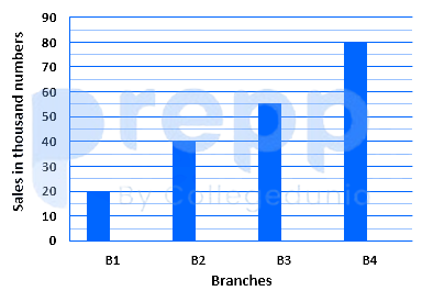
The number of shop in which sales of books are below the average level is:
- Sales of books from four shops (B1, B2, B3, B4) in thousands are given as below. Study the graph and answer the following questions.
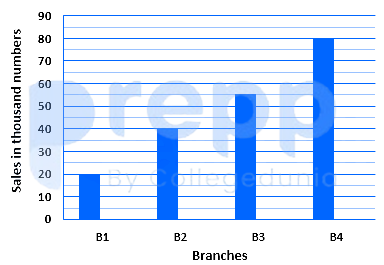
The average sales of book from shop B1, B2 and B4 is closest to:
The following tables show the product sold by a shopping app in 3 years. Find the average number of clothes sold by the app in all three years.
Products
2019
2020
2021
Cloth
824
476
500
Electronics
750
820
450
Makeup
660
810
510
Footwear
470
390
790
The table given below shows the number of male and female in different states.
States Male Female A 50 100 B 200 150 C 300 25 D 25 50 E 125 75 F 150 250 J1 = The value of average number of males in A and B.
J2 = The value of average number of females in E and F.
What is the value of (J2 - J1)?
The pie chart given below shows the expenditure (in percentage) of Aditya. The monthly income of Aditya is ₹54,000.
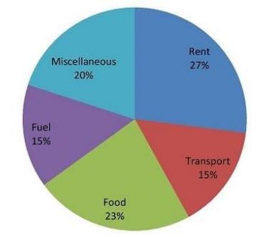
How much does he spend (in ₹) on Food?


