
Study the table carefully to answer the question that follows: The given table has the number of boys and girls (in hundreds) in 5 different years in 4 different schools (A, B, C, D) (M - Boys, F - Girls).School → A B C D ↓ Year M F M F M F M F 2016 4.2 4.7 6.3 4.2 5.6 3.5 7.6 7.7 2017 7.7 5.3 5.9 3.3 4.4 5.5 6.6 4.7 2018 10.4 7.9 5.7 5.3 5.9 6.4 3.8 3.5 2019 6.5 10.7 7.4 6.5 6.3 4.3 6.5 6.8 2020 9.5 11.9 8.6 6.9 7.6 5.4 7.9 7.6
Which year has the minimum number of girls enrolled during 2016-2019?
2017
Analyzing School Enrollment Data
The question asks us to find the year between 2016 and 2019 that had the lowest total number of girls enrolled across four different schools (A, B, C, D). The provided table shows the enrollment numbers for boys (M) and girls (F) in hundreds for each school over five years.
| School → | A | B | C | D | ||||
| M | F | M | F | M | F | M | F | |
| 2016 | 4.2 | 4.7 | 6.3 | 4.2 | 5.6 | 3.5 | 7.6 | 7.7 |
| 2017 | 7.7 | 5.3 | 5.9 | 3.3 | 4.4 | 5.5 | 6.6 | 4.7 |
| 2018 | 10.4 | 7.9 | 5.7 | 5.3 | 5.9 | 6.4 | 3.8 | 3.5 |
| 2019 | 6.5 | 10.7 | 7.4 | 6.5 | 6.3 | 4.3 | 6.5 | 6.8 |
| 2020 | 9.5 | 11.9 | 8.6 | 6.9 | 7.6 | 5.4 | 7.9 | 7.6 |
To find the year with the minimum number of girls enrolled, we need to sum the number of girls (F) for all four schools (A, B, C, D) for each year from 2016 to 2019. Remember that the numbers are in hundreds.
Calculating Total Girls Enrollment by Year
- Year 2016: Total girls = (Girls in A + Girls in B + Girls in C + Girls in D)
- Total girls in 2016 = $(4.7 + 4.2 + 3.5 + 7.7)$ hundreds
- Total girls in 2016 = $20.1$ hundreds = $20.1 \times 100 = 2010$
- Year 2017: Total girls = (Girls in A + Girls in B + Girls in C + Girls in D)
- Total girls in 2017 = $(5.3 + 3.3 + 5.5 + 4.7)$ hundreds
- Total girls in 2017 = $18.8$ hundreds = $18.8 \times 100 = 1880$
- Year 2018: Total girls = (Girls in A + Girls in B + Girls in C + Girls in D)
- Total girls in 2018 = $(7.9 + 5.3 + 6.4 + 3.5)$ hundreds
- Total girls in 2018 = $23.1$ hundreds = $23.1 \times 100 = 2310$
- Year 2019: Total girls = (Girls in A + Girls in B + Girls in C + Girls in D)
- Total girls in 2019 = $(10.7 + 6.5 + 4.3 + 6.8)$ hundreds
- Total girls in 2019 = $28.3$ hundreds = $28.3 \times 100 = 2830$
Now, let's compare the total number of girls enrolled in each year:
- 2016: 2010 girls
- 2017: 1880 girls
- 2018: 2310 girls
- 2019: 2830 girls
Comparing these totals, we can see that the minimum number of girls enrolled during the 2016-2019 period was 1880, which occurred in the year 2017.
Minimum Girls Enrollment Year
Based on our calculations, the year with the minimum number of girls enrolled among the given options (2016, 2017, 2018, 2019) is 2017.
Revision Table: Key Enrollment Figures
| Year | Total Girls (Hundreds) | Total Girls (Actual Number) |
|---|---|---|
| 2016 | 20.1 | 2010 |
| 2017 | 18.8 | 1880 |
| 2018 | 23.1 | 2310 |
| 2019 | 28.3 | 2830 |
The minimum value in the 'Total Girls (Actual Number)' column for the years 2016-2019 is 1880, corresponding to the year 2017.
Additional Information: Data Interpretation Basics
Data interpretation often involves extracting specific information from tables, charts, or graphs and performing calculations to answer a question. In this case, we used a data table showing school enrollment. Key steps involved:
- Understanding the units (numbers are in hundreds).
- Identifying the relevant data (girls' enrollment for each school and year).
- Aggregating data (summing enrollment across schools for each year).
- Comparing results (finding the minimum value among the yearly totals).
Practice with different types of data representations (bar graphs, pie charts, line graphs) and question types (total, average, ratio, percentage change) is crucial for improving data interpretation skills.
Important Questions from Data Interpretation
The table given below shows the earnings of two persons on five different days.
What is the ratio of total earnings of P to the total earnings of Q?Earnings Days P Q Monday 105 150 Tuesday 96 110 Wednesday 65 122 Thursday 115 106 Friday 130 68 The table below shows the number of toys of 6 different colours sold from a shop during a given period. The table also shows the percentage of toys of each colour which are cars.
Colour Total toys Percentage of cars C1 500 12 C2 600 15 C3 400 12.5 C4 550 10 C5 650 20 C6 450 10 What is the total number of car toys of C2 and C3 taken together?
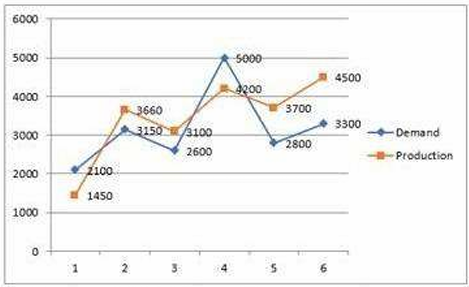
Study the given graph carefully and answer the question that follows. The graph shows the demand and production of different companies.
The ratio between the companies having more production than demand and more demand than production is:
Study the given table and answer the question that follows. The given table shows the number of new employees added to different categories of employees in a company for four years and the number of employees from these categories who left the company every year.
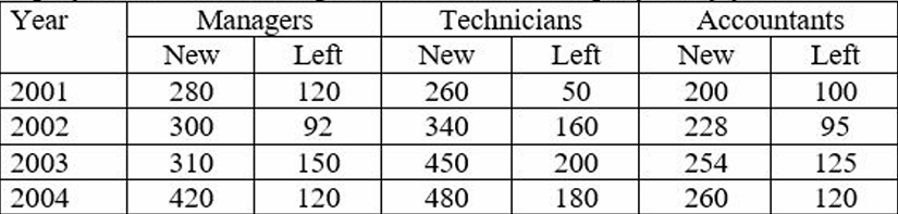
During the period between 2001 and 2004, the total number of Technicians who left the Company is what percentage (rounded off to the nearest integer) of the total number of Technicians who joined the Company?
The given pie-chart shows the percentage distribution of 20,000 employees in a company. Study the given chart and answer the question that follows. If 30% of the employees in department D are females, then how many male employees are there in that department?


