
Read the given passage and answer the questions that follow The following table has the number of enrolled students for a particular course and year. Total number of seats are given in brackets with respect to each course. Number of Enrolled Students BTech MTech MPhilYear
(120)
(30)
(20)MBA
(60)2016 96 24 12 52 2017 110 26 14 57 2018 108 25 13 54 2019 112 28 15 56 2020 104 27 16 48
Which year has highest average enrollment?
2019
Understanding the Enrollment Data
The question asks us to identify the year with the highest "average enrollment" based on the provided table. The table lists the number of students enrolled in four different courses (BTech, MTech, MPhil, MBA) from 2016 to 2020. Total available seats for each course are also provided in brackets, although they might not be directly needed to answer this specific question as it asks for average enrollment, not enrollment percentage.
The table is as follows:
| Year | Number of Enrolled Students | |||
|---|---|---|---|---|
| BTech (120) | MTech (30) | MPhil (20) | MBA (60) | |
| 2016 | 96 | 24 | 12 | 52 |
| 2017 | 110 | 26 | 14 | 57 |
| 2018 | 108 | 25 | 13 | 54 |
| 2019 | 112 | 28 | 15 | 56 |
| 2020 | 104 | 27 | 16 | 48 |
To find the year with the highest "average enrollment," we need to interpret what "average enrollment" means in this context. Given the structure of the data (enrollment numbers per course per year), "average enrollment" for a specific year most likely refers to the average number of students enrolled across all the courses in that year. Since there are four courses listed for each year, we can calculate the total enrollment for each year and then divide by 4 to find the average per course. Alternatively, we can just compare the total enrollment for each year, as dividing by a constant (4) will not change the relative order, and the year with the highest total enrollment will also have the highest average enrollment per course.
Calculating Total Enrollment Per Year
Let's calculate the total number of enrolled students for each year by summing the enrollments for all four courses in that year.
- Year 2016: Total Enrollment = Enrolled BTech + Enrolled MTech + Enrolled MPhil + Enrolled MBA
Total Enrollment (2016) $= 96 + 24 + 12 + 52 = 184$ - Year 2017: Total Enrollment = Enrolled BTech + Enrolled MTech + Enrolled MPhil + Enrolled MBA
Total Enrollment (2017) $= 110 + 26 + 14 + 57 = 207$ - Year 2018: Total Enrollment = Enrolled BTech + Enrolled MTech + Enrolled MPhil + Enrolled MBA
Total Enrollment (2018) $= 108 + 25 + 13 + 54 = 200$ - Year 2019: Total Enrollment = Enrolled BTech + Enrolled MTech + Enrolled MPhil + Enrolled MBA
Total Enrollment (2019) $= 112 + 28 + 15 + 56 = 211$ - Year 2020: Total Enrollment = Enrolled BTech + Enrolled MTech + Enrolled MPhil + Enrolled MBA
Total Enrollment (2020) $= 104 + 27 + 16 + 48 = 195$
Comparing Total Enrollments
Now we compare the total enrollment calculated for each year:
- 2016: 184
- 2017: 207
- 2018: 200
- 2019: 211
- 2020: 195
The highest total enrollment is 211, which occurred in the year 2019.
Identifying the Year with Highest Average Enrollment
Since the year with the highest total enrollment will also have the highest average enrollment (total enrollment divided by 4), the year 2019 has the highest average enrollment.
Therefore, the year with the highest average enrollment is 2019.
Revision Table: Enrollment Summary
| Year | Total Enrolled Students | Average Enrollment (Total / 4) |
|---|---|---|
| 2016 | 184 | 46 |
| 2017 | 207 | 51.75 |
| 2018 | 200 | 50 |
| 2019 | 211 | 52.75 |
| 2020 | 195 | 48.75 |
The table confirms that 2019 has the highest total and highest average enrollment among the given years.
Additional Information: Data Interpretation Skills
This question tests basic data interpretation skills, specifically reading information from a table and performing simple calculations (addition and comparison). When faced with data in tables, it's important to:
- Understand the headings and what each row and column represents.
- Identify the specific information needed to answer the question.
- Perform the required calculations accurately.
- Compare values if necessary to find maximum, minimum, or trends.
- Pay close attention to what is being asked (e.g., total, average, percentage).
In this case, understanding "average enrollment" as either total enrollment or average per course was key, and both approaches lead to the same conclusion because the number of courses considered is constant.
Important Questions from Data Interpretation
The table given below shows the earnings of two persons on five different days.
What is the ratio of total earnings of P to the total earnings of Q?Earnings Days P Q Monday 105 150 Tuesday 96 110 Wednesday 65 122 Thursday 115 106 Friday 130 68 The table below shows the number of toys of 6 different colours sold from a shop during a given period. The table also shows the percentage of toys of each colour which are cars.
Colour Total toys Percentage of cars C1 500 12 C2 600 15 C3 400 12.5 C4 550 10 C5 650 20 C6 450 10 What is the total number of car toys of C2 and C3 taken together?
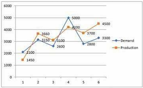
Study the given graph carefully and answer the question that follows. The graph shows the demand and production of different companies.
The ratio between the companies having more production than demand and more demand than production is:
Study the given table and answer the question that follows. The given table shows the number of new employees added to different categories of employees in a company for four years and the number of employees from these categories who left the company every year.
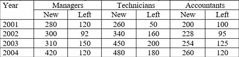
During the period between 2001 and 2004, the total number of Technicians who left the Company is what percentage (rounded off to the nearest integer) of the total number of Technicians who joined the Company?
The given pie-chart shows the percentage distribution of 20,000 employees in a company. Study the given chart and answer the question that follows. If 30% of the employees in department D are females, then how many male employees are there in that department?


