
The quality of services delivered by a company consists of six factors as shown below in the radar diagram. The dots in the figure indicate the score for each factor on a scale of 0 to 10. The standardized coefficient for each factor is given in the parentheses. The contribution of each factor to the overall service quality is directly proportional to the factor score and its standardized coefficient. 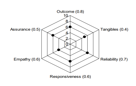
The lowest contribution among all the above factors to the overall quality of services delivered by the company is
To determine the lowest contribution among the factors to the overall quality of services delivered by the company, we need to calculate the contribution of each factor using the given scores and standardized coefficients. The contribution is calculated as the product of the score and the standardized coefficient for each factor.
Let's list each factor along with its score from the radar diagram and its standardized coefficient:
- Outcome: Score = 8, Coefficient = 0.8
- Tangibles: Score = 7, Coefficient = 0.4
- Reliability: Score = 6, Coefficient = 0.7
- Responsiveness: Score = 5, Coefficient = 0.6
- Empathy: Score = 4, Coefficient = 0.6
- Assurance: Score = 6, Coefficient = 0.5
Calculating each factor's contribution:
- Outcome: Contribution = \(8 \times 0.8 = 6.4\)
- Tangibles: Contribution = \(7 \times 0.4 = 2.8\)
- Reliability: Contribution = \(6 \times 0.7 = 4.2\)
- Responsiveness: Contribution = \(5 \times 0.6 = 3.0\)
- Empathy: Contribution = \(4 \times 0.6 = 2.4\)
- Assurance: Contribution = \(6 \times 0.5 = 3.0\)
The contributions are as follows:
- Outcome: 6.4
- Tangibles: 2.8
- Reliability: 4.2
- Responsiveness: 3.0
- Empathy: 2.4
- Assurance: 3.0
The lowest contribution is from Empathy, with a contribution of 2.4.
To find the percentage contribution of Empathy relative to the total sum of all contributions:
\[\text{Total Contribution} = 6.4 + 2.8 + 4.2 + 3.0 + 2.4 + 3.0 = 21.8 \] \[ \text{Percentage of Empathy} = \left(\frac{2.4}{21.8}\right) \times 100 \approx 11\%\]Since none of the options exactly match this percentage, the closest option is 10%, which indicates the lowest contribution is approximately 10%.
Important Questions from Data Interpretation
The table given below shows the earnings of two persons on five different days.
What is the ratio of total earnings of P to the total earnings of Q?Earnings Days P Q Monday 105 150 Tuesday 96 110 Wednesday 65 122 Thursday 115 106 Friday 130 68 The table below shows the number of toys of 6 different colours sold from a shop during a given period. The table also shows the percentage of toys of each colour which are cars.
Colour Total toys Percentage of cars C1 500 12 C2 600 15 C3 400 12.5 C4 550 10 C5 650 20 C6 450 10 What is the total number of car toys of C2 and C3 taken together?
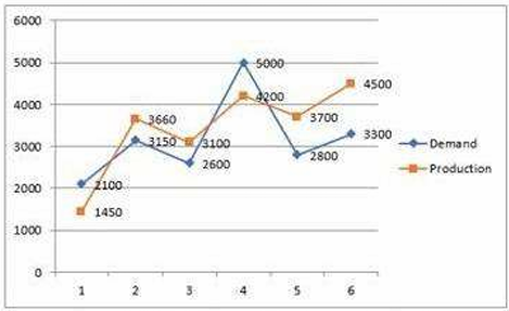
Study the given graph carefully and answer the question that follows. The graph shows the demand and production of different companies.
The ratio between the companies having more production than demand and more demand than production is:
Study the given table and answer the question that follows. The given table shows the number of new employees added to different categories of employees in a company for four years and the number of employees from these categories who left the company every year.
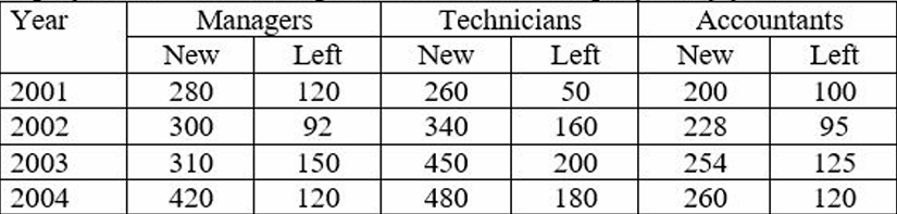
During the period between 2001 and 2004, the total number of Technicians who left the Company is what percentage (rounded off to the nearest integer) of the total number of Technicians who joined the Company?
The given pie-chart shows the percentage distribution of 20,000 employees in a company. Study the given chart and answer the question that follows. If 30% of the employees in department D are females, then how many male employees are there in that department?


