
The fuel consumed by a motorcycle during a journey while traveling at various speeds is indicated in the graph below. The distances covered during four laps of the journey are listed in the table below From the given data, we can conclude that the fuel consumed per kilometre was least during the lap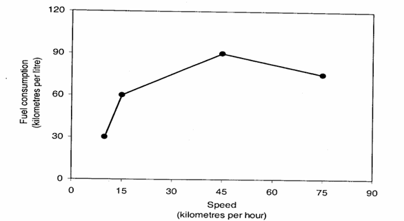
Lap Distance (kilometers) Average speed (kilometers per hour) P 15 15 Q 75 45 R 40 75 S 10 10
To determine the lap during which the fuel consumed per kilometer is the least, we need to understand the relationship between speed and fuel consumption as indicated by the graph and the data in the table.
The graph shows fuel consumption (in kilometers per litre) versus speed (in kilometers per hour). The key point is to identify which speed results in the highest fuel efficiency, i.e., the maximum kilometers per litre, which corresponds to the least fuel consumed per kilometer.
From the graph:
- At 15 km/h, the fuel consumption is approximately 45 km/l.
- At 45 km/h, the fuel consumption is approximately 90 km/l.
- At 75 km/h, the fuel consumption decreases again, indicating lower km/l.
From this observation:
- The highest fuel efficiency (90 km/l) occurs at 45 km/h.
Now, compare this with the table:
| Lap | Distance (kilometers) | Average speed (kilometers per hour) |
| P | 15 | 15 |
| Q | 75 | 45 |
| R | 40 | 75 |
| S | 10 | 10 |
The average speed during lap Q is 45 km/h, which corresponds to the highest fuel efficiency observed from the graph (90 km/l). Therefore, the fuel consumed per kilometer is the least in lap Q.
Thus, the correct answer is Q.
Important Questions from Data Interpretation
The table given below shows the earnings of two persons on five different days.
What is the ratio of total earnings of P to the total earnings of Q?Earnings Days P Q Monday 105 150 Tuesday 96 110 Wednesday 65 122 Thursday 115 106 Friday 130 68 The table below shows the number of toys of 6 different colours sold from a shop during a given period. The table also shows the percentage of toys of each colour which are cars.
Colour Total toys Percentage of cars C1 500 12 C2 600 15 C3 400 12.5 C4 550 10 C5 650 20 C6 450 10 What is the total number of car toys of C2 and C3 taken together?
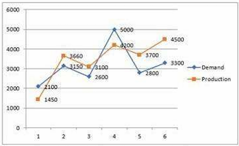
Study the given graph carefully and answer the question that follows. The graph shows the demand and production of different companies.
The ratio between the companies having more production than demand and more demand than production is:
Study the given table and answer the question that follows. The given table shows the number of new employees added to different categories of employees in a company for four years and the number of employees from these categories who left the company every year.
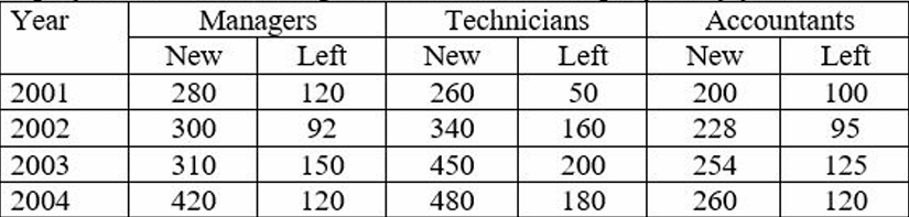
During the period between 2001 and 2004, the total number of Technicians who left the Company is what percentage (rounded off to the nearest integer) of the total number of Technicians who joined the Company?
The given pie-chart shows the percentage distribution of 20,000 employees in a company. Study the given chart and answer the question that follows. If 30% of the employees in department D are females, then how many male employees are there in that department?


