
List-I
GraphList-II
Application(a) Histogram (i) Joining mid-points (b) Bar Graph (ii) Part to whole (c) Pie Chart (iii) Continuous Data (d) Frequency Polygon (iv) Comparison of categories
Choose the most appropriate answer from the options given below :
Graph Matching: Understanding Chart Applications
This question requires matching different types of graphs (List-I) with their primary applications (List-II). Let's break down each graph type and its use:
Analyzing Graph Types and Applications
- (a) Histogram: A histogram is used to represent the distribution of **continuous data**. It groups data into bins (intervals) and shows the frequency of data points within each bin. This helps visualize the shape of the data distribution (e.g., skewed, normal). The application that best fits this description is (iii) Continuous Data.
- (b) Bar Graph: Bar graphs are excellent for comparing quantities across different discrete **categories**. Each bar represents a category, and its height or length shows the value or frequency for that category. This is ideal for the (iv) Comparison of categories.
- (c) Pie Chart: A pie chart represents data as slices of a circle, where each slice's size is proportional to the quantity it represents. It's fundamentally used to show how a whole is divided into parts, illustrating the (ii) Part to whole relationship.
- (d) Frequency Polygon: A frequency polygon is typically created by plotting points corresponding to the frequency of each class interval and then connecting these points with straight line segments. It's often used to visualize the shape of a distribution and is particularly useful when comparing multiple distributions. It connects the (i) Joining mid-points of the class intervals (often the mid-points of the tops of histogram bars).
Matching Lists
Based on the analysis above, the correct matches are:
- (a) Histogram matches with (iii) Continuous Data.
- (b) Bar Graph matches with (iv) Comparison of categories.
- (c) Pie Chart matches with (ii) Part to whole.
- (d) Frequency Polygon matches with (i) Joining mid-points.
Resulting Match
Therefore, the correct combination is (a)-(iii), (b)-(iv), (c)-(ii), (d)-(i).
| List-I (Graph) | List-II (Application) |
| (a) Histogram | (iii) Continuous Data |
| (b) Bar Graph | (iv) Comparison of categories |
| (c) Pie Chart | (ii) Part to whole |
| (d) Frequency Polygon | (i) Joining mid-points |
This corresponds to the matching pair (a)-(iii), (b)-(iv), (c)-(ii), (d)-(i).
Important Questions from Data Interpretation
The table given below shows the earnings of two persons on five different days.
What is the ratio of total earnings of P to the total earnings of Q?Earnings Days P Q Monday 105 150 Tuesday 96 110 Wednesday 65 122 Thursday 115 106 Friday 130 68 The table below shows the number of toys of 6 different colours sold from a shop during a given period. The table also shows the percentage of toys of each colour which are cars.
Colour Total toys Percentage of cars C1 500 12 C2 600 15 C3 400 12.5 C4 550 10 C5 650 20 C6 450 10 What is the total number of car toys of C2 and C3 taken together?
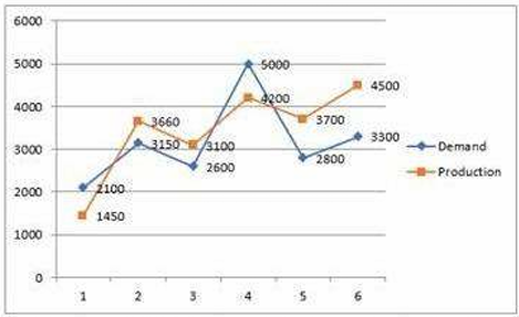
Study the given graph carefully and answer the question that follows. The graph shows the demand and production of different companies.
The ratio between the companies having more production than demand and more demand than production is:
Study the given table and answer the question that follows. The given table shows the number of new employees added to different categories of employees in a company for four years and the number of employees from these categories who left the company every year.
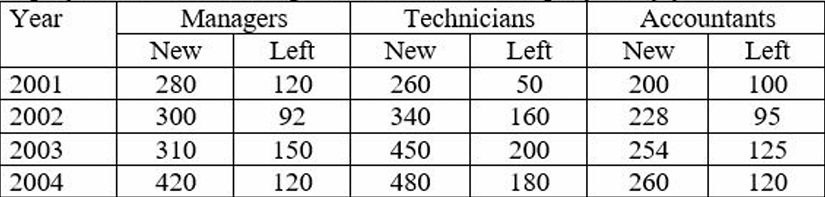
During the period between 2001 and 2004, the total number of Technicians who left the Company is what percentage (rounded off to the nearest integer) of the total number of Technicians who joined the Company?
The given pie-chart shows the percentage distribution of 20,000 employees in a company. Study the given chart and answer the question that follows. If 30% of the employees in department D are females, then how many male employees are there in that department?


